
Your Logo Could Save Lives or Lose Trust in Seconds
First impressions count in health care. A logo tells your brand before you utter the first word. It promises care, safety and professionalism. Regardless of whether you are launching a clinic, developing a telehealth app, or creating a brand of pharmacy, your visual identity will determine how people will perceive your services even before they talk to you.
This is where medical logo design becomes important, it sets the tone for your entire brand. Here, you will find the way to make the ideal medical or health care logo by following the best tips, useful tools and examples. Let’s explore how to design a medical logo that builds instant trust and credibility.
Table of Contents
- Why Your Logo Matters in Health Care
- What to Include in a Medical Logo
- Best Colors and Fonts to Use
- Tools to Make Your Logo Online
- Great Examples to Learn From
- Final Thoughts on Designing with Care
Why Your Logo Matters in Health Care

In health care, the process of trust starts much earlier than during the first appointment. In many cases, it begins with a basic design, such as a logo. Not all patients will read through your entire website or reviews, but they will follow your branding. A good and well-designed logo demonstrates a serious attitude to the work, and such people are more likely to feel more confident when they select your services.
The best medical logo design needs no words. It speaks of respect, hygiene and trust. Your logo goes everywhere with your brand. The range includes clinic signs, appointment cards and digital adverts. When it is good, it makes people remember you, feel safe with you, and come again when they need care.
What to Include in a Medical Logo

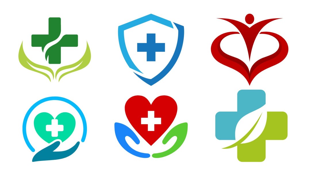
What your health care brand is all about should be evident in your medical logo. It must appear professional, relaxed and non-technical. What your health care brand is all about should be evident in your medical logo. It must appear professional, relaxed and non-technical. Best medical logos have a simple, yet meaningful symbol which symbolizes health, care, or recovery. Popular options include a cross, a heart or a stethoscope, but you can also use something special that suits your service. You should select a symbol which is recognizable, significant and uncluttered.
Typography matters as well as colour. Subtle colors such as green and blue are good since they bring about feelings of calmness, cleanliness and safety. White space makes the logo breathe and not crowded. The font should be readable and modern, but not cold. An excellent medical health logo design is one that strikes you as caring, reliable and professional. To further support your branding efforts, you can also explore healthcare illustration templates that visually align with your logo and reinforce your overall visual identity.
Best Colors and Fonts to Use
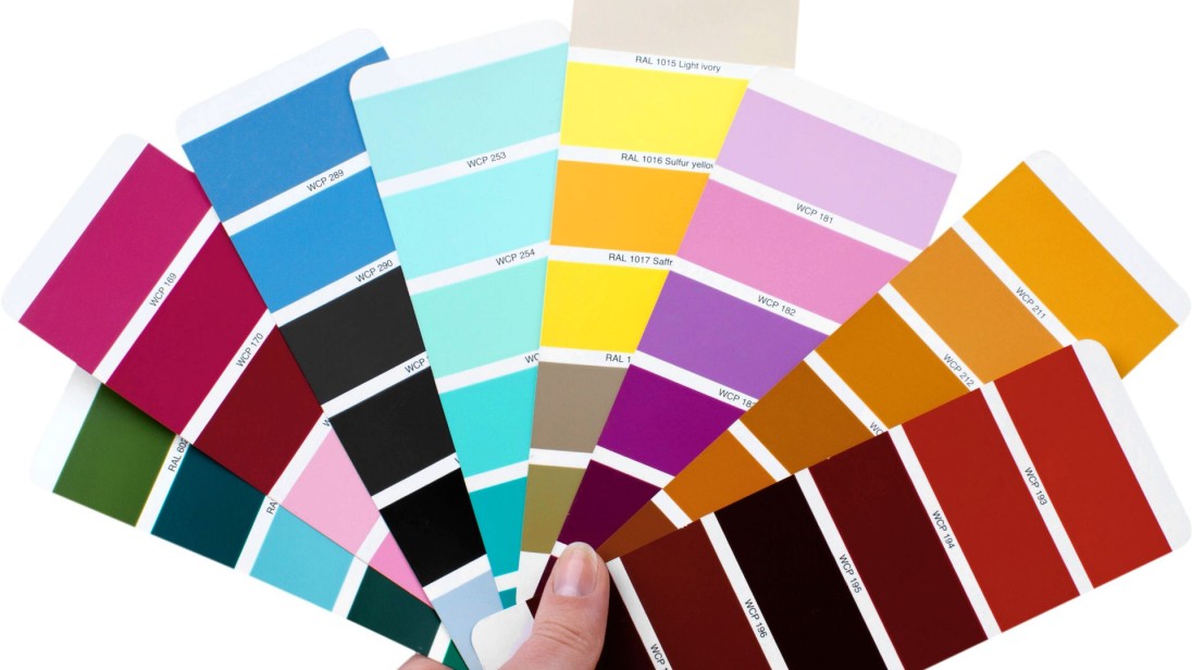
Choosing the right colors and fonts is not just about style. It is about how people feel when they see your brand. Color psychology in branding for medical logo design plays a big role in creating trust, calm, and a sense of care from the very first glance.
Blue creates a sense of trust
Blue is the colour most applied to medical branding. It is relaxed, hygienic, and professional. Lots of hospitals and clinics prefer the blue colour as it makes patients feel secure and confident.
Green brings a feeling of healing
Green has been associated with healing and regeneration, as well as nature care. It will be effective in wellness centres, clinic therapy, and any health brand that is balanced or nature-related.
White adds a clean and fresh look
White space contributes towards a sense of openness and a straightforward quality of your logo. It presents a feeling of cleanliness, and this is valuable in health care. It also assists the other design elements to be prominent.
Use accent colors wisely
Your main colours can be supplemented and reinforced by soft grey, beige, or light pastels. Brighter colors such as red or orange should also be used sparingly because they are too aggressive or informal as health-related branding.
Best fonts for a Healthcare logo design
The fonts should be readable, professional, and legible. They aid in creating the atmosphere of your brand and are to correspond to the clean quality of your logo. Pick a font or two that suits your brand. It is also not recommended to have an elaborate or cursive font because they may not be legible or appear out of place in a medical environment. These five good font options are often applied in health care logo design:
- Lato: Simple, soft, and modern
- Open Sans: Very readable and neutral
- Montserrat: bold but clean, great for names
- Roboto: Modern and versatile for digital use
- Helvetica: Classic and trusted across industries
Tools to Make Your Logo Online
Zoviz
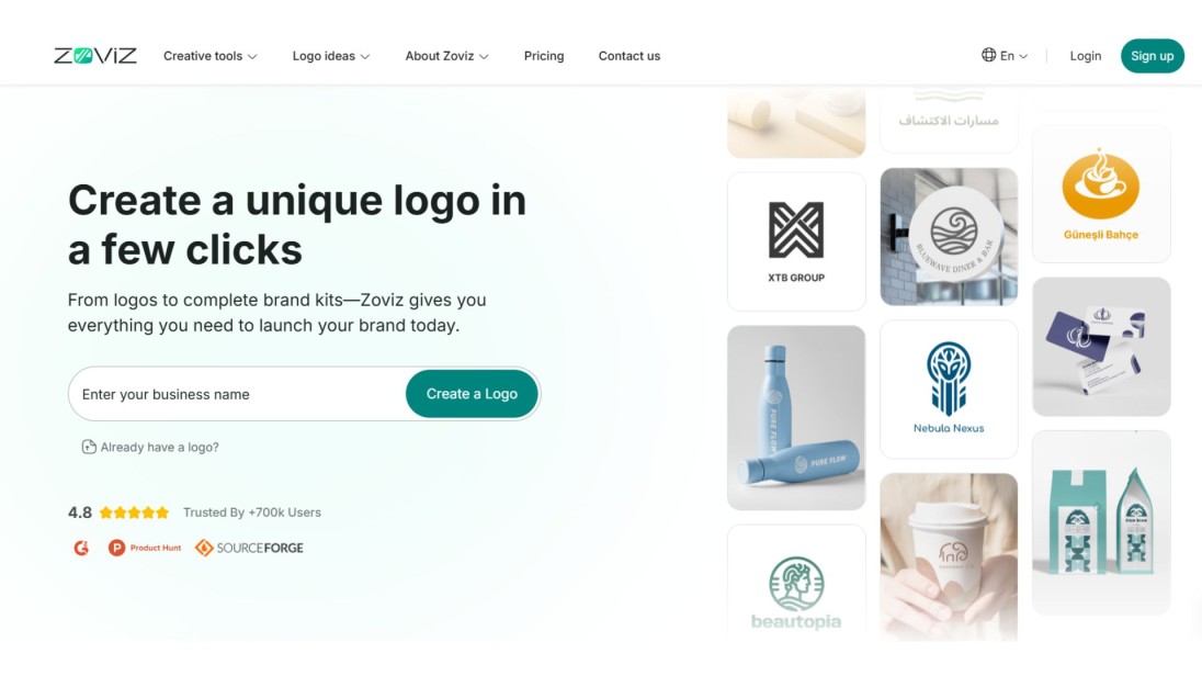
Zoviz is a top AI healthcare logo design tool that designs personal healthcare logos and fitness brands. You receive exclusive icons and a full brand kit including logo. All that is available to download is of high quality and usable across platforms.
Price: Logo-only for $19.99, Full Brand Kit for $49.99 (one-time payment)
Canva
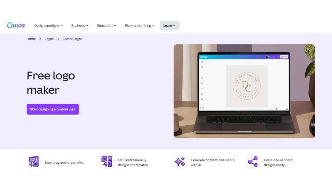
Canva is ideal when one needs to create a medical logo since it allows one to create it with or without a healthcare template. It has a simple drag-and-drop builder and a good selection of free components. Excellent to make fast corrections and have easy Medical Logo Designs without being an expert.
Price: Free plan available, Premium plans start around $8–$12 per month
Looka
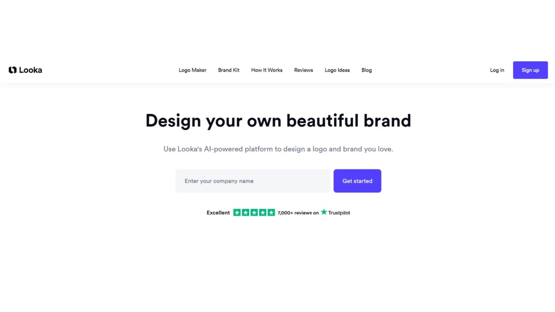
Looka is a Medical Logo Designer that is designed by AI, and allows you to edit colours, fonts and layouts to your own taste. There are numerous designs to select from, and branding tools can be provided.It is also an excellent option when users require a clean professional logo fast and with few design inputs.
Price: Basic logo $20, Premium logo $65, Brand Kit $96–$129 per year
Great Examples to Learn From
Red Cross for A Global Symbol of Emergency Care
The Red Cross logo is the most popular medical icon in the world. Its basic red cross symbol represents help, protection, and emergency care. It is prominent, strong, and recognisable across all countries due to its clean shape and strong colour.
Mayo Clinic for Trust Built Through Simplicity
Mayo Clinic has three icons that depict care, research, and education using a shield symbol. The logo is relaxed, formal and levelled off. Its sharp lines and obvious composition show the great history of the clinic of professional medical service.
Teladoc Health for Modern and Digital-Friendly
The Teladoc logo displays a harmless purple icon, thick, contemporary, text, with a balance of technology and care. It shows a humane health brand that is technology-focused. The design is welcoming and trustworthy, depicting how a healthcare logo can remain business-like yet adopt digital technologies.
Conclusion
Designing a medical logo is not only a matter of making it pretty but rather establishing a bond and trusting patients in your logo. It is a matter of developing trust, being caring and making people feel safe about your brand. The selection of colours and fonts, symbols that speak to what you provide, all these make a difference in the eyes of the patients.
A well-considered logo can trumpet your entire work, be it a hospital, a clinic or a wellness brand. Reserve some time to consider and look at practices that others find successful and use intelligent tools like Zoviz to develop your vision. A tasteful and readable logo can make your brand more apparent but more significant, it will assist patients to feel secure using your services.


