
Some logos say everything about a brand without using a single word. That’s the power of a pictorial mark logo.
A pictorial mark logo does just that. The single pristine image of the bitten apple and the bullseye will evoke an instant connection with every language and every screen size.
What makes a pictorial mark logo so good? Research indicates that the brain processes images up to 60,000 times quicker than text; thus, an icon will appear to your client before a headline can load. It is also easy to scale, reading sharp in a favicon as it reads sharp in a billboard.
Over the next few minutes, you will discover the easy mind-to-logo model that great brands apply to transform crude concepts into recognisable logos. You will learn how to select a picture that will bring out your narrative, get inspired with live cases and walk away with a realistic step-by-step strategy (and the tools) to create a logo that people will remember at a glance.
Table of Contents
- Why a Pictorial Mark Logo Works So Well
- How to Choose the Right Symbol for Your Brand
- Real World Pictorial Logo Examples That Make an Impact
- Step by Step Process to Create a Pictorial Mark Logo
- Best Tools to Design Your Logo Fast (No Design Skills Needed)
- Should You DIY or Hire a Designer?
- Final Tips for a Professional Finish
- Wrap Up: Design a Logo People Remember
Why a Pictorial Mark Logo Works So Well

A pictorial mark logo is made up of a picture or an icon; there is no text or any tagline. That is why this brand can be easily remembered. Visuals are processed much faster by people than words, and image-based logos are therefore good at recalling the brand.
Most big brands start with a word and a picture, then the single picture becomes their trademark. This is how Apple, Twitter and Target evolved.
How to Choose the Right Symbol for Your Brand

The selection of the symbol is not just selecting something pretty. Ask yourself:
- What is the essence that I want my brand to communicate?
- Is there an easy picture which relates to my goods or brand principles
- Does this icon stand alone and remain meaningful
Eco-friendly brands often use a leaf or water drop symbol to show their values. Clean geometry is common among tech brands. Use characteristic examples of pictorial marks logo design to find a style that is new yet has character.
Real World Pictorial Logo Examples That Actually Work
You must have a vision of what success is before blazing your own pictorial mark logo. The outstanding way? Use brands that use pictorial mark logos with success as examples.v
These businesses became world-renowned, having only a single icon. No words. No taglines. Simple, good design, which can not be forgotten.
Apple
What comes to your mind as you look at a bitten apple?
You already guessed it was Apple. There is no image of a phone or a laptop in this logo. It is only an ordinary form. However, it says: clean, modern, and creative. It transcends cultures and language and is one of the strongest examples of pictorial mark logos ever designed.
The logo of Twitter is a small blue bird. It is soft, friendly and energetic.
That bird embodies everything Twitter is, that is, concise terms, instant responses, and universal discussions. On a little screen, you see the bird and immediately think, Twitter. This is the effectiveness of the proper symbol.
Target
You need not read “Target” to understand that it is them. Red bullseye tells it all.
It’s bold. It’s round. It’s focused. This proves how a simple shape, when done well, can make a lasting impact.
Step by Step Process to Create a Pictorial Mark Logo

You do not have to be a graphic designer to create a strong visual identity. A successful pictorial mark logo begins with good thinking and results in a symbol that people recall.
1. Define your brand story
Consider what your business is all about. Do you want it to be assertive, soothing, playful or trustworthy? Your logo must be dictated by these feelings. An obvious message will lead you to the correct visual that indicates what your brand stands for.
2. Sketch simple ideas
Start rough. Apply shapes such as leaves, waves, or any other that can relate to your brand information. These initial concepts should not be flawless. They are simply only a starting point when thinking of your pictorial mark logo design.
3. Experiment with color and spacing
Select two to three colours suiting your brand. Apply sufficient white space to allow the design to be readable and clear. Color choice shapes emotion and trust which boosts recognition. Plainness enhances recall and increases the professionalism of your logo
4. Test it at different sizes
A phone screen, a business card and even a billboard. Your logo must be clear on all of these. Reduce it and enlarge it. When it is functioning, yes, you are doing what is right.
5. Compare to iconic examples
Examine such good pictorial logos as Apple, Twitter, or Target. Why are they effective? So, how does your design do? After this analysis, you can improve your layout or simplify your shape, style, and format.
Best Tools to Design Your Logo Fast (No Design Skills Needed)
A high-quality pictorial mark logo can be created without being a professional designer. Such instruments make it much more straightforward and enable you to create a brand image in a few minutes. All you need to do is select your brand style and edit a little bit, and you are done.
Zoviz
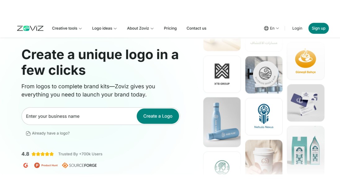
Zoviz is an excellent branding tool choice if you require an entire branding solution. It is more than a logo maker. It offers you a complete identity package. It is a pictorial logo maker online relying on the power of AI to propose logos that align with your brand style, industry, and message. After selecting a design, Zoviz provides downloadable files, such as PNG, SVG, and PDF, a social media kit, email signatures, and product mock-ups. When you are starting with nothing, Zoviz is efficient and clever. You can find useful examples of How to Make a Logo With Zoviz in 3 Steps, which includes both real-life examples and insider advice from the Zoviz team.
Canva
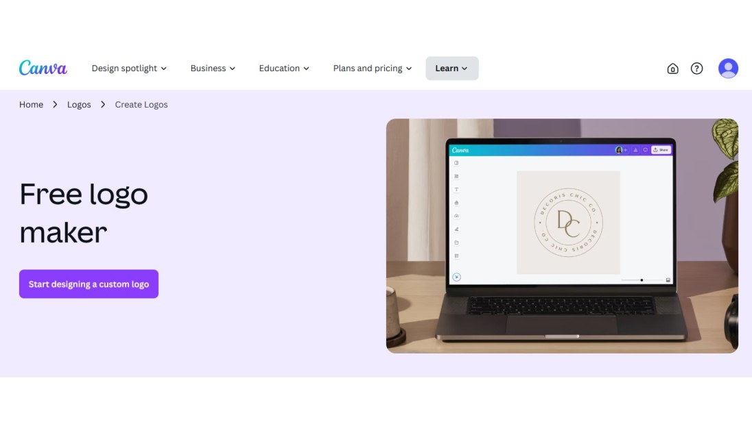
Another good choice would be Canva if you would like to personalise all the elements of your design. You are provided with hundreds of pictorial mark logo templates and a drag-and-drop interface that anyone can handle. It is possible to change shapes, colours, fonts, and spacing to apply the look that fits your brand. It is perfect when used by the owners of small businesses that require their logos, flyers, and visuals on social media to be coherent.
Looka
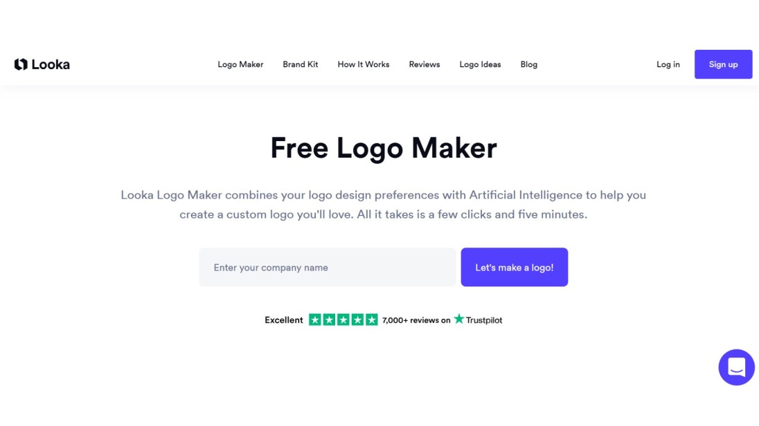
It would be a good idea to use Looka when you need quick results. It guides you through the process by asking smart questions and then presents a list of logo choices depending on your liking. It is possible to edit typefaces as well as symbols and layout. Looka also provides you with more than 300 brand assets such as business cards, social banners, and brand guidance. It is a trusted tool when you are looking forward to creating a pictorial mark logo design quickly and yet maintain it professionally.
Should You DIY or Hire a Designer?

Want full control and a tight budget? Go DIY.Explore options with tools such as Zoviz or Canva, experiment with ideas, and create something personal for you. These sites are constructed by novices, although the outcomes may appear professional.
Have a bigger budget and need precision? Hire a pro. A good designer will provide fresh ideas, be in line with your brand vision and develop a professional logo. It is a fine choice when you want a unique logo where the competition is intense.
Both paths work. All you need to ensure is that your winning logo aligns with your brand narrative and can be easily identified on every platform.
Final Tips for a Professional Finish
Wish your pictorial mark logo to be created by one of the best agencies? Do these:
- Cut the clutter – Simple shapes work best
- Stick to bold colors – One main, one accent
- Test on real surfaces – Try it on apps, websites, packaging
- Use just one icon – Don’t confuse people with too much
- Ask real users for feedback – What do they feel at first glance?
These facts distinguish an ordinary design from a brand asset with longevity.
Wrap Up:
Your pictorial mark logo is the fastest way to make your brand instantly memorable. An easy, striking symbol penetrates the media clutter and stays lodged in the mind of the customer for long after seeing it. Begin by identifying the important message in your brand. Draw up something that will convey that feeling in one picture. Then whittle down to the barest that is left, only that shape that can be easily remembered. Try it even on the smallest icons of your apps as well as enormous billboards, because you need to be sure that it looks great in any size.
When you have a clear idea, you can use tools such as Zoviz or Canva to create your logo in a professional manner within minutes. Use two to three colours that fit the personality of your brand and ensure that there is sufficient space around your icon so that it is clear and easy to read. Test your designs on actual users and get sincere reviews to perfect your logo and make it your own brand. Do this and you will get a pictorial logo mark that is not only appealing but also touches the hearts of your audience.


