
Logos are everywhere, but only a few truly stand out.
How do some logos stay in memory while other logos forget themselves? Design trends combined with catchy fonts do not fully explain the success of memorable logos. The strongest logos create mental connections at the heart of their audience. These visuals express brand narratives by focusing on fundamental brand values after revealing shared emotions.
A superior logo achieves more than visual beauty since it leaves a lasting impression, which builds brand recognition and trust among consumers. These particular logos from Nike and Apple manage to go beyond their company identities to attain universal iconic status. What strategies exist for developing logos that gain attention over time?
The following article presents 10 fundamental guidelines for designing logos which help generate powerful, meaningful visual identities. Let’s dive in!
Table of Contents
- Why Logos Matters?
- What Makes a Good Logo?
- 10 Tips for a Great Logo Design
- Refining Your Logo
- How to Make Your Logo Look Professional
- Conclusion
Why Logos Matters?

A logo stands above being just visual because it can do much more. Your brand identity consists mostly of logo components, which represent vital aspects of your brand identity. The world's iconic logos, including Nike, Apple and McDonald's, go beyond recognition because they establish brand trust and loyalty and trigger particular emotions.
Your well-designed logo will allow potential customers to grasp your identity and activities before introducing your products or services. Every time potential customers see your brand information, they first encounter your logo, which appears on cards and large billboards.
Emotional Connection
A well-designed logo creates emotional relationships between your brand and its customers. People who develop a connection with your brand increase their trust in the brand. A logo serves as the fundamental element for building brand loyalty because of its vital role in customer recognition. Your logo must connect with people at a personal level to achieve lasting recognition.
The Risk of a Bad Logo
An inadequate logo design will produce severe negative consequences for a business. A poorly designed logo can split your customer base while undermining your business's professionalism because it fails to represent your company values. The competitive market demands perfect first impressions, so businesses with poor logos might lose customers.
What Makes a Good Logo
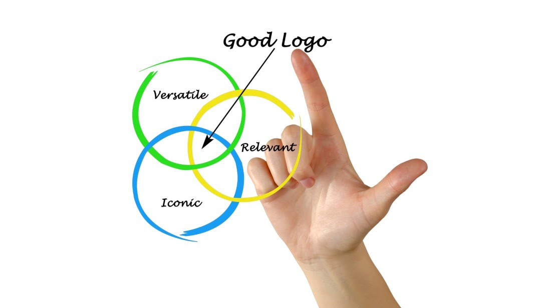
Understanding how logos achieve effectiveness determines the process of creating branding designs that best reflect your brand purpose. These essential characteristics must be present in any strong logo design.
1. Keep It Simple: Less is More
A superb logo depends fundamentally on keeping things basic. A messy logo design confuses people while reducing its overall functionality because it fails to maintain basic recognition power. Your logo becomes adaptable and multi-purpose because its clean design structure provides flexibility for multiple reproduction methods from various media platforms.
Strong companies like Apple and Google demonstrate successful characteristics through their simple logo designs. Their streamlined logos deliver large amounts of significant meaning. Simple logos can be recognized by all audiences no matter what the display platform is, such as websites, business cards and outdoor billboards.
2. Make It Stick: Craft a Logo That’s Hard to Forget
A logo remains effective when it leaves a lasting mental impact on people. Your logo should create an instant memory in people when they encounter it. While a distinctive logo features visible characteristics and gets noticed readily, it also carries dual qualities of uniqueness and recognition. The worldwide recognition of McDonald's golden arches and the Nike swoosh comes without any necessity for descriptive language.
A memorable logo creates an immediate connection with your audience while staying in their minds long after exposure.
3. Built to Last: Design a Logo That’s Timeless
Good logos possess enduring qualities since web design trends constantly change. The logo must display everlasting appeal that extends into the future despite changes in design fashions. Your logo design choice needs careful planning since strong dependence on recent trends will soon result in time-consuming and costly redesigns. Select a timeless design because it demonstrates longevity.
4. Designed for Any Medium: Keep It Versatile

Your logo needs to maintain excellent visual quality regardless of what environment people encounter. Any display method, from business cards to website headers and billboards, requires a logo that remains easy to understand no matter how big or small it is displayed. Your logo needs to maintain clarity when presented in black and white and colour formats while being compatible with various display media and surface types.
Your logo should maintain its appearance when viewed on screens of multiple sizes and when printed out in various dimensions.
5. Make It Meaningful: Keep It Relevant to Your Brand
The logo should demonstrate business's core values and deliver essential business messages to customers. A logo must specifically reflect the goods you provide, along with a clear delivery of your intended message to your targeted audience. A business logo for legal practices uses classic font and colour choices, whereas tech start-ups choose modern, sophisticated designs.
A relevant logo will deliver your intended message to your audience, thus making them more closely identify with your brand.
10 Tips for a Great Logo Design
Understanding logo quality criteria enables you to learn practical steps toward making an outstanding logo design.
1. Use Icons to Tell Your Story

An image expresses more than a thousand spoken words. Visual elements like icons and symbols, together with images, possess storytelling power that surpasses the capabilities of words alone. Incorporating a visual component which accurately represents your business concept should replace mere brand name usage.
Twitter chose a bird symbol as its logo, which represents its main values: freedom and communication. The straightforward symbolic marker functions as a visual representation of the brand's essential values in a glance.
2. Whitespace is Powerful
Your design depends equally upon the appropriate use of both included elements and spaces of emptiness. Your logo becomes more vibrant by using whitespace because it avoids visual congestion. Your design improves when you use whitespace properly because it produces an elegant and sophisticated end result.
The clear areas within the FedEx logo structure the design to show a concealed arrow while keeping the overall concept easy to understand.
3. Use Shapes to Convey Meaning
Designers use shapes to provide more than visual beauty because each shape conveys specific meanings. The circular design creates a sense of trust and unity as well as fullness because it conveys completion. The stability strength of squares contrasts with triangle symbols, which show energy, innovation, and movement. Select your chosen shapes for the logo design with the intent to establish the intended message clearly.
4. Visualise Your Logo in Different Contexts
When finalising your logo design, step back and envision its appearance across various application platforms and output formats. Your logo must excel across the various business platforms involving your website, in addition to basic business cards, social media presence, and promotional products. The logo needs to function properly regardless of the context in which it appears.
Websites show logo graphics beautifully, but these designs may fail when reduced for mobile application icons. Consider all possibilities.
5. Colours Matter

Your brand receives its perception through how different emotions connect to particular colours that you use in your branding. Red symbols drive passionate feelings but create strong energy, while blue cuts trustworthiness into your products. Optimism is displayed through yellow colours, while green represents natural elements as well as growth.
Select your logo colour scheme methodically. The use of limited colours will preserve both visual order and impact. Your logo will appear confusing when you use many colours simultaneously; therefore, avoid excessive colour use to maintain clarity.
6. Be Literal When Necessary
Sometimes, simplicity is best. You should apply literal design elements to achieve instant comprehension from your audience about your business operations. The logo of a pizza restaurant features a pizza slice as an element, yet photographic businesses use photographic cameras in their logos.
When business operations start, it becomes essential to employ literal design methods that help customers rapidly identify your product offerings.
7. Ensure Authority with Your Logo
Your logo should exude confidence. Bold typography, along with strong lines, should be selected to present authority. Your brand suffers from weakness when using thin fonts along with washed-out colours because these features convey unprofessionalism to your audience.
Simple lines, together with font styles that match your brand identity create a logo which presents itself as professional yet trustworthy.
8. Add a Pop of Color

Minimalist logos look better than maximalist logos when you add a bold accent colour, which attracts viewers to essential design elements. Selecting an accent colour allows you to focus attention on particular logo elements while adding movement to the design.
The simple red and white colour combination of Coca-Cola creates powerful brand recognition thanks to the immediately memorable effect of red.
9. Don't Be Afraid to Innovate

Minimalist logos look better when you add a bold accent colour, which attracts viewers to essential design elements. Selecting an accent colour provides the ability to focus attention on particular logo elements while adding movement to the design.
The simple red and white colour combination of Coca-Cola creates powerful brand recognition thanks to the immediately memorable effect of red.
10. Stick to Design Principles
Creative thinking should lead your design process, although you need to maintain essential design principles. The creation of a visually attractive logo requires knowledge about balance and symmetry to achieve proportional arrangements.
You should now focus on enhancing your logo design after its creation has been completed. Begin the process by requesting feedback from those who make up your primary audience. Inquire your audience about the messages conveyed through the logo and ask if they reflect your brand's core values.
You must evaluate your logo design using different size scales together with multiple background layouts. The logo rendition that appears flawless on white surfaces experiences reduced performance when placed on dark or colourful backgrounds. Regular solid logos retain their strength when used in every platform application.
How to Make Your Logo Look Professional
Your logo needs three guidelines to achieve professional quality:
Keep It Simple: Less is More in Logo Design
Simplicity works as a key ingredient to provide logo clarity. The use of basic linear design throughout your logo will keep your visual identity both easy to identify and adaptable for various purposes. Design efficiency means eliminating all meaningless excess details from your logo so your brand elements can draw attention. The eponymous appearance of logos maintained by Apple and Nike endures as time progresses because they convey both straightforwardness and memorability.
Typography Matters: Choose Fonts That Speak for Your Brand

Your business receives significant messages from the selections you make regarding fonts. Determine the specific mood along with the tone and personality which you wish your brand to convey. Your brand receives its initial impression through the fonts you choose because different typefaces either convey a contemporary sans-serif appearance or classic elegance. You should select fonts that retain clarity while maintaining their quality until the logo size varies.
Balance is Key: Align Your Logo Elements Like a Pro
When elements within your logo arrangement are correctly placed, it prominently influences how viewers perceive your logo. When all elements match and remain balanced, the logo appears pleasant to view. Present all textual elements and shape and image components with careful consideration to achieve a professional look. Designing your logo with a balanced composition brings out feelings of reliability while enhancing customer trust, which creates brand connection.
The Devil is in the Details: Small Tweaks Make a Big Difference
A logo differentiates itself from others by refining small design elements. The final part of the process includes precise letter spacing adjustments, followed by proportion corrections and detailed attention to produce a refined final version. Small modifications result in significant effects, leading to a superior logo design than an ordinary one. Generic attention to detail reveals your focus on producing high-quality brand identity.
Think Timeless: Design for the Long Run
Good logos maintain timeless value beyond short-lived design trends. Design a logo based on your brand essentials, which will remain appealing throughout numerous years instead of selecting fads. First-class logos enable brand consistency as well as minimize the need for constant redesign work. It's best to choose enduring design elements which possess lasting appeal.
Conclusion
Your ability to design perfect logos depends both on creative vision and strategic planning. Paying attention to simple design along with meaningful relevance and enduring value in your logo makeup enables you to develop artwork that establishes brand representation combined with enduring longevity.
A brand shows its initial face to the world through its established logo. Your logo must display both your true identity and core values. You can now develop a logo that makes long-lasting marks because of the advice given here.


