I have been dealing with logos for years since and I will tell you a secret: you do not have to be a professional designer to make something really outstanding. And whether you are starting your first company or just redesigning an old company, I will show you the basic principles that have assisted me in creating dozens of effective logos.
Your logo is not a pretty picture, but the face of your whole brand. It is what they will recall when they hear about your business. So here is what I have learned about coming up with logos that actually stick in people's minds.
So, whatever your skill level may be, you should consider these principles as the starting point for a unique and distinctive logo that should reflect your brand.
How to Make a Great Logo?
- Exploring Symbolic Concepts
- Utilizing Available Space
- Playing with Letter Case Styles
- Embracing Handwritten Fonts
- Achieving Balance in Taglines
- Adjusting Name and Tagline Placement
- Giving Your Logo Breathing Room
- Ensuring Easy Readability
- Crafting a Versatile Design
- Enhancing Background Contras on
Let's delve deeper into these foundational tips to make logo guidelines:
1. Think Beyond the Obvious (Symbolic Concepts Matter):
My initial logo-designing mistakes were the oldest ones: when a client sold coffee, I would sketch a cup of coffee. Simple, right? Wrong.
The most effective logos narrate a more significant story. Consider the swoosh of Nike which is not a shoe but motion and vitality. Or the apple of Apple- it's not an apple but knowledge, innovation.
Whenever I brainstorm, now I ask myself, "What is the feeling that this brand creates? That is what your symbol must represent. Abstract concepts tend to be more effective than literal representations since they provide space to your logo as your brand develops.
My approach:
- List 3-5 core values of the brand
- Consider feelings and ideas, and not merchandise.
- Develop 10+ rough ideas and then select one.
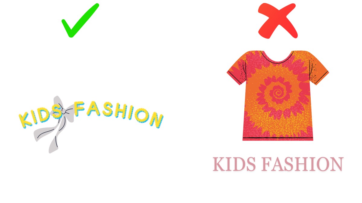
2. Learn How to Space (It is Your Canvas).
This was a bitter lesson that I had to experience after stuffing a complete company name of a client into a small square. It appeared messy and amateurish.
Space is now one of my strategic tools. When your company name is very long, I tend to divide it into two lines. However, the most important thing is that here, you should keep the font the same size as well and still unified. The empty space of elements is equal to elements.
3. Playing with Letter Case Styles:
In some cases, the finest details create the best logo design. Experimenting with something as simple as a letter case, which is possible by using a free logo design tool, can change the whole feeling of your logo.
Uppercase letters often imply authority and power, while lowercase letters are friendlier and more informal. In order to obtain their desired brand image, companies need to find a balance between all of the elements.
I always test my logos in different case styles. Sometimes a simple switch from uppercase to lowercase completely transforms the vibe from "intimidating corporation" to "friendly neighborhood business."
| Case Style | Personality | Best For | Example Brands |
| ALL UPPERCASE | Bold, authoritative, corporate | Law firms, financial services, luxury brands | IBM, NASA, CNN |
| lowercase | Friendly, approachable, modern | Tech startups, creative agencies, lifestyle brands | facebook, adidas, ebay |
| Title Case | Professional, balanced, trustworthy | B2B companies, consulting, healthcare | LinkedIn, YouTube, PayPal |
| Mixed Case | Creative, unique, memorable | Entertainment, innovative products | FedEx, eBay, iPhone |
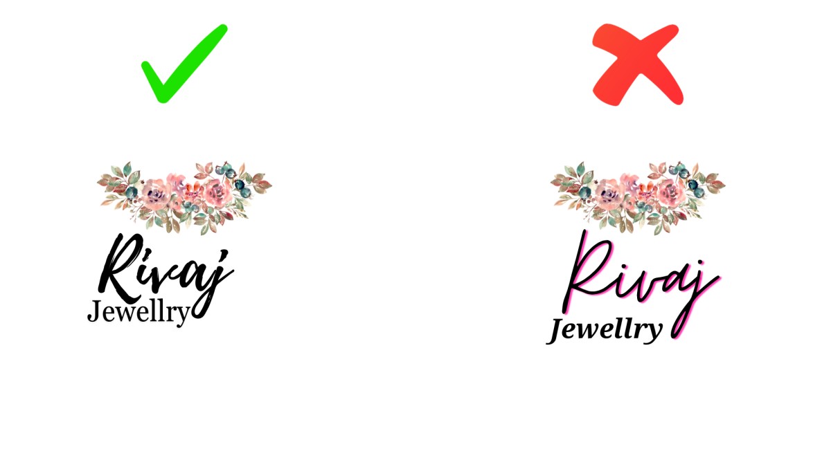
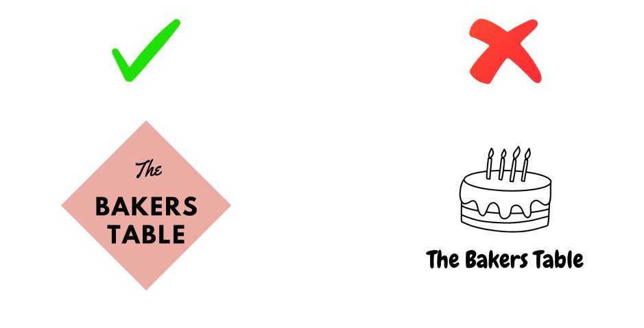
4. Embracing Handwritten Fonts:
One of the leading trends related to the logotype today is creative typography. Examples of such are handwritten fonts that will look personally done and yet authentic. These slogans will particularly fit well for headlines.
However, handwritten fonts should not always be used in uppercase, or they will destroy credibility. The balance here lies in the choice of font.
My rule of thumb: Use handwritten fonts for your tagline or as an accent, not for your entire logo. And please, keep them in lowercase or sentence case where they feel most natural.
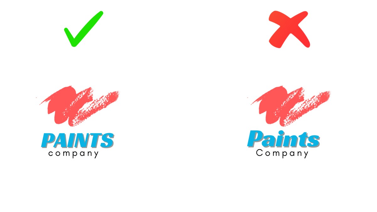
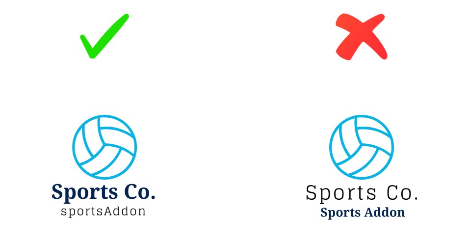
5. Achieving Balance in Taglines:
Visual balance is not some abstract design trend but what makes your logo seem right when a person looks at it.
My maximum tagline is 25-30 characters. Any further and it begins to compete with your company name. I have done this myself by designing logos with the tagline taking up more space than the brand name.
This is how I do it: when I use a bold font when typing out the company name, I make it thinner and plain in the case of the tagline. This establishes a level of hierarchy and leads the eye in a natural manner with the most important part (your name) and the supporting part (your tagline).
| Company Name Style | Tagline Style | Visual Effect |
| Bold Sans-Serif | Light Sans-Serif | Modern, clean, tech-forward |
| Thick Display Font | Thin Serif | Elegant, high-end, sophisticated |
| Heavy Script | Simple Sans-Serif | Creative yet grounded |
| Strong Geometric | Delicate Script | Balanced, approachable |
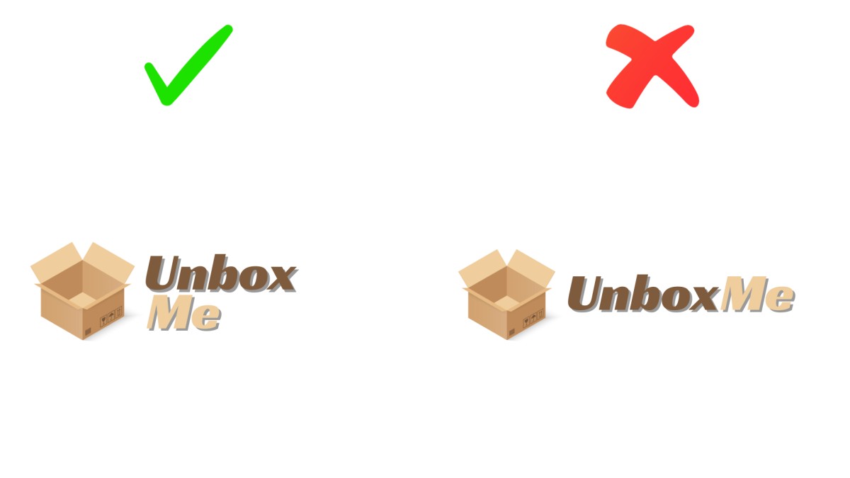
6. Adjusting Name and Tagline Placement:
The number of times I have shifted items by a couple of pixels to get that just-right balance, I cannot tell you. You must pay when your company name is longer than your tag line.
How I have found it best: change the scale and the orientation. In order to introduce the visual equilibrium, make the tagline a bit bigger or even rotate the elements. In a few instances, I will make the letter spacing of the tagline the same width as the company name displayed above it.
This may not be an exciting statement, yet you will find it all comes together as soon as you see it.
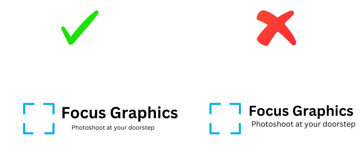
7. Giving Your Logo Breathing Room:
When I was young I used to pack everything close due to fear of wasting space. Big mistake. The surrounding and the interior area of your logo is equally significant as the logo itself.
Imagine it to be like a frame of a work of art. When you are working on your logo, and either you are professional or just work with a free online tool, nothing should feel tight.
What I always check:
- Does it have sufficient padding at all edges?
- Are individual elements clearly defined?
- Will the logo continue to be attractive even after scaling out?
I usually reserve a minimum of 10-15 percent of the total space as vacuity. It makes your logo feel high quality and gives it breathing room.
8. Ensuring Easy Readability:
You will see your logo at the top of all your web pages, in addition to business cards and elsewhere. Your message must always be visible on all of them, which is the case for most free online AI logo generators and all other design professionals’ software.
My readability checklist:
- Am I able to read it on my phone with my arm?
- Does it scale in thumb nail size (favicon size)?
- Is it readable in black and white?
- Do the vision-impaired older people still read it?
9. Crafting a Versatile Design:
For instance, a logo should have dimensions that allow it to be resized to any size. Doing so can be achieved via an AI logo generator or any good designer software such as CorelDraw or Adobe Photoshop. Nonetheless, a small logo must still be readable and definite, regardless of its location. Also, another design element must undergo this here.
Versatility is non-negotiable in modern logo design. Your logo needs to scale beautifully whether it's on a massive billboard or a tiny app icon.
I always work in vector format (even if I'm starting with an AI logo generator, I convert to vector). This means your logo can be sized to infinity without losing quality. I've seen too many businesses struggle because their logo was designed as a raster image and falls apart when enlarged.
My versatility testing process:
- Scale it down to 16x16 pixels (favicon size)
- Scale it up to 10 feet wide (trade show booth size)
- Convert it to grayscale
- Test it in reverse (white on dark)
If it passes all these tests, you've got a versatile design.
| Application | Minimum Size | What to Check |
| Favicon | 16×16 pixels | Are shapes still recognizable? |
| Social Media Profile | 180×180 pixels | Does text remain legible? |
| Business Card | 1–2 inches | Is detail preserved? |
| Website Header | Variable | Does it scale responsively? |
| Print Materials | 300 DPI minimum | Are edges crisp and clean? |
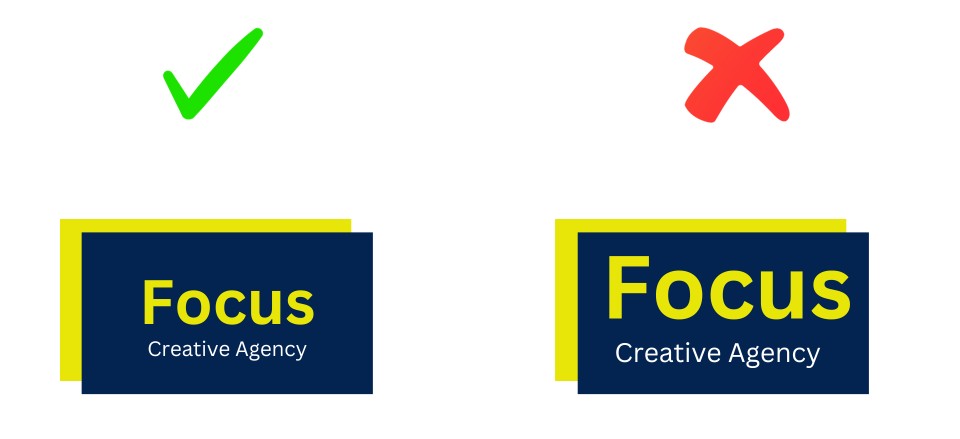
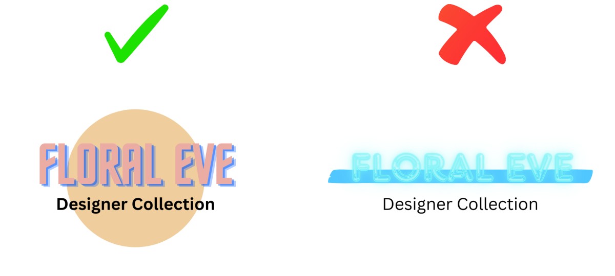
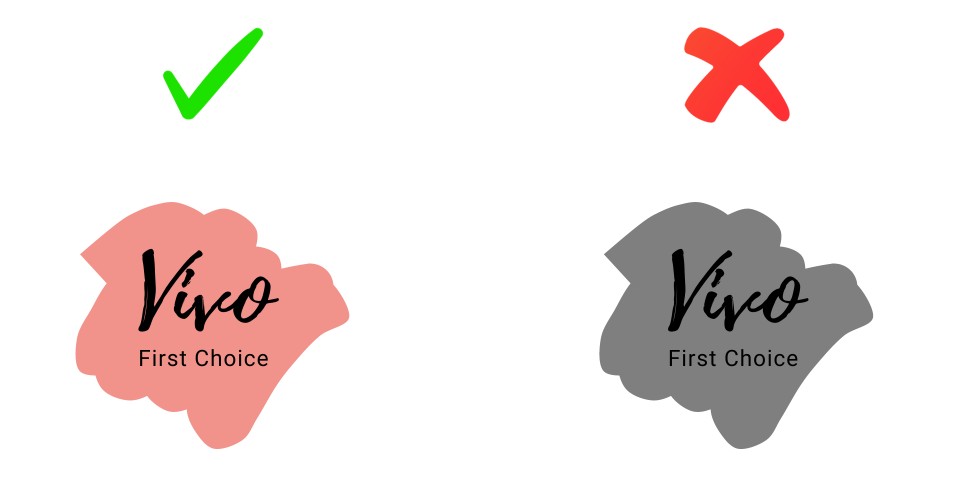
10. Enhancing Background Contrast:
This is where a lot of DIY logos fail. You need strong contrast between your logo and its background, or it simply disappears.
I always design my logos to work on multiple backgrounds. White text on black? Perfect. Dark text on white? Beautiful. But what about that trendy gradient background or a photograph?
My approach to color selection:
- Use the color wheel to understand complementary colors
- Apply basic color psychology (blue for trust, red for energy, green for growth)
- Test your logo on light, dark, and medium-toned backgrounds
- Create alternative versions if needed (one for light backgrounds, one for dark)
I typically create at least three versions of every logo: full color, black, and white. This ensures I'm prepared for any application.
Final Thoughts From My Journey
To make a great logo, there is no rule to follow, it is about the knowledge of rules and the ability to know when these rules have to be used. I have violated some of these rules personally when the project required it, and that is all right.
The most important thing is that your logo can be your real brand, can appeal to your target audience, and can be used everywhere you require it to be used.
Start simple. Test often. Get non-designer feedback. And keep in mind - the most iconic logos that we have today have undergone numerous iterations before they got to where they are today.
You've got this. Now go make something great.
Frequently Asked Questions
Q1: Should I use an AI logo maker or hire a professional designer?
It varies based on your timeline and budget. AI logo generators are great for side hustles, startups, or experiments with business ideas, I have seen some amazing outputs recently. But if you're launching a serious brand with long-term ambitions, hire a pro designer who can provide strategic insight and bespoke solutions.
Q2: How many colors should my logo have?
Use no more than 1-3 colors. The majority of the most well-known logos (Apple, Nike, McDonald's) have minimal colors since they are easier to print, more memorable, and more adaptable. I personally always work on a single color version first if that is feasible, the design is solid. Anything more than three colors gets complicated in a hurry.
Q3: What's the biggest mistake beginners make when designing logos?
Overcomplicating. Newbies include too many elements, fonts, colors, and effects, attempting to depict all that their business does. The most effective logos are virtually always simple, Apple, Nike, Target, come to mind.
Once you've created your logo, start stripping away elements until you can't strip away anything more without losing clarity. That's your sweet spot.
Q4: How do I know if my logo will still look good in 5-10 years?
Use my Timelessness Test:
1. Steer clear of faddish effects (gradients, drop shadows, 3D)
2. Use traditional fonts rather than fashionable ones.
3. Ask yourself: "Could this have worked 20 years ago?"
4. Tests in black and white classic designs don't require color.
Design for the future, not the present. Your logo will be current now but yet timeless in a decade.