
What makes you examine the evolution of the Instagram logo throughout its historical alterations?
Instagram’s iconic symbol conveys the complete transformation that the platform underwent from its beginnings as a basic image-sharing service into its current position as a worldwide social network platform.
The Instagram platform launched in 2010 with a different appearance to its current logo. The years have brought evolution to the Instagram symbol, which has developed into an attractive contemporary icon that is easily recognizable by everyone.
There are multiple reasons why Instagram has implemented different key logo designs that have helped it stand out throughout the years. What was the main reason behind this change rather than seeking to be stylish?
We will investigate Instagram's original logo story alongside its historical development and understand its modern special elements in this piece. People can find value in learning about the transformation of Instagram's logo because it contains a fascinating story.
Table of Contents
- What is Instagram?
- Why Does a Logo Matter?
- The First Instagram Logo
- Changes Over Time
- The Current Instagram Logo
- The Meaning Behind the Colors
- Why Did Instagram Change Its Logo?
- How People Reacted to the New Logo
- The Influence of the Instagram Logo
- The Role of Simplicity in Logo Design
- Future Possibilities for the Instagram Logo
- The Impact of Logos on Brand Success
- Conclusion
What is Instagram?
People on Instagram use the social media application to display photos and multimedia content through its platform. Instagram appeared in 2010 before reaching worldwide fame. Each day, millions of users choose Instagram to share important highlights of their existence. The platform has added Stories as well as Reels and live-streaming functionalities since its inception in 2010. Since its launch in 2010, Instagram has developed into an influential ecosystem that serves the needs of all its users, including both personal parties, professional companies, and famous internet personalities.
Users leverage Instagram as an essential platform to manage digital marketing strategy and branding operations and to deliver entertainment content. The social media network Instagram has transformed human communication by making it more picture-based, whereas modern users now interact through videos. Instagram continues to rank as a top influential social media platform because it constantly updates its features through innovations.
Why Does a Logo Matter?
A business faces its public through its logo, which is similar to people recognising each other by face. The brand becomes easier to identify because of this element. Companies need logos that feature three important characteristics: simplicity, memorability and meaningfulness. The logo of Instagram has evolved over time, yet users have consistently been able to identify it easily. When a company develops an effective logo, its users become more loyal and recognize it more easily. Companies invest significant resources to create their logos because of their essential role. The correctly designed logo packs all essential company information about values and purpose into one quick visual representation. The Instagram logo shows creativity along with simplicity and modern design elements. The progress of design trends drives brands to refresh their logos to maintain both relevance to and appeal to their customer base.
The First Instagram Logo
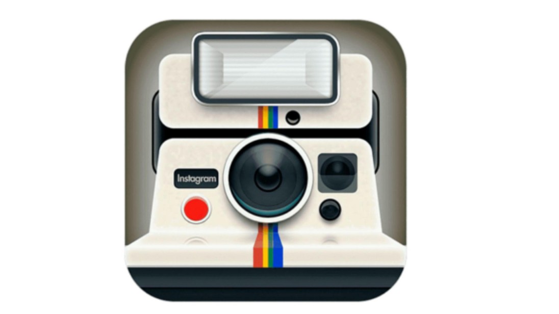
In 2010, Instagram marketing premiered with a logo that was distinct from its current appearance. The small device featured a classic camera appearance with brown and beige shades. The company selected this logo because it aimed to create a retro appearance for its users, who mainly shared images that imitated historical film prints. The company took its design inspiration from retro Polaroid cameras because these photographic devices gained immense popularity during the era of instant imagery. The vintage camera design made the logo easily recognizable compared to other social media websites. Instagram started with an intricate logo created to represent it as an environment tailored to photography fanatics. Many people loved the original logo design ideas, yet Instagram made a new update to suit its more significant brand identity.
Changes Over Time
Instagram's logo has changed a few times to match modern trends. Here are the major updates:
1. The First Logo (2010)
- The camera reminded viewers of the vintage Polaroid product.
- Had brown and beige colours
- Simple yet detailed design
- The designers created this logo to match the distinctive vintage filter design of Instagram.
- At its launch, Instagram focused primarily on photo capture and filtering capabilities through this logo design.
- Instant photo sharing relates directly to the essence of the Instagram application through its design features.
2. The 2011 Update
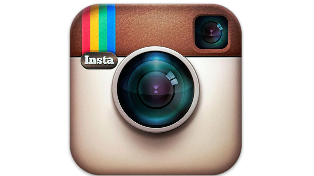
- The designers focused on giving the camera interface a finished appearance.
- Kept the same vintage style
- A gentle 3D feature was integrated to deliver a realistic visual appearance.
- The logo received enhanced visual details, which made it more attractive to viewers.
- Several modest changes increased the logo's perceptibility and comprehensibility.
- Shoulder in a modern touch to the logo during its update, keeping the original classical style intact.
3. The 2016 Major Change
- Instagram released an entirely new graphical update to its platform.
- The original camera function received a replacement by a present-day colourful modern icon.
- Survivors exhibited diverse reactions toward the major design modification.
- The logo transitioned from its retro appearance to display a sleek digital presentation.
- Focused on simplicity and vibrancy
- The new design elements made Instagram compatible with the leading mobile app trends of its time.
The Current Instagram Logo
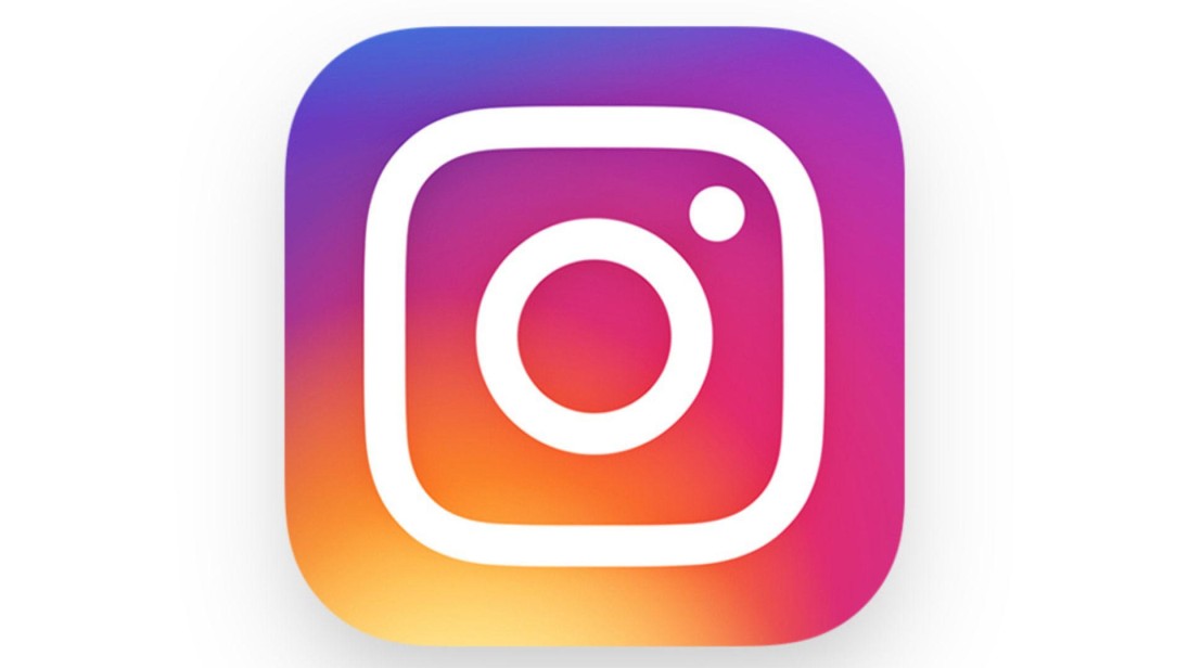
The present-day logo shows a basic camera icon that features multiple shades of colour. You can find this logo design displaying pink, purple and orange colour schemes. This design combines modern elements with minimalistic qualities to produce a pleasing digital screen appearance. The present-day logo stands apart because of its flat abstract shape, which provides flexibility for various screen sizes. The updated design brought Instagram’s branding structure into harmony with contemporary design patterns. The straightforward design gives the logo both straightforward recognition capabilities and potential for varied size use. The visual attractiveness of the design results from the gradient effect that creates depth and movement. As part of its rebranding initiative, Instagram designed this change to demonstrate its shift from a basic photo-sharing application to a social media solution platform.
The Meaning Behind the Colors

The choice of colours in the Instagram logo possesses a specific design reason:
- Pink and Orange represent energy and creativity.
- Purple in the design creates feelings of fun intermixed with imagination.
- A gradient effect in the design makes it appear contemporary.
- The warm, shining colors produce an inviting, engaging atmosphere.
- The image represents the diverse user base along with the open inclusiveness of Instagram.
- These colourful tones render the logo more noticeable to viewers.
Why Did Instagram Change Its Logo?
Many factors led Instagram to transform its logo appearance.
- The old logo looked outdated.
- The application exceeded its status as a photo-sharing service through the launch of Stories Reels and IGTV features.
- A contemporary logo presentation makes the application appear both novel and engaging.
- The gradient colour scheme of the logo made Instagram stand out from other social networks present in the market.
- The modification belonged to a broader repositioning initiative that aimed to display Instagram's development mission.
- The design upgrade served to draw younger users but also aimed at meeting contemporary design standards.
How People Reacted to the New Logo

Many Instagram users were surprised when the platform unveiled its colourful logo in 2016. Many users celebrated the new logo presence, but numerous others stated their preference for the previous camera design. The distinctive logo has become widely recognized by people as it replaced the analogue camera design that viewers initially hesitated to accept. The social media world first saw great disagreement about the new brand logo through user reactions which included both positive and negative sentiments.
The introduction of the new logo enabled it to link with Instagram's changing image. User resistance to the fresh design initially disappeared when people began to appreciate this modern aesthetic. Modern people identify the logo with its status as a creative indicator of innovation as well as digital cultural representation.
The Role of Simplicity in Logo Design

People retain simple logos better and recognize them more easily. Instagram adopted a streamlined layout by design transformations that major brands currently implement. The versatility of logos, along with their timelessness, is directly linked to simplicity. Logos with clean designs prove more suitable for multiple marketing materials. Success-driven organizations progressively simplify their logos as they aim to preserve their contemporary attractive brand image.
Future Possibilities for the Instagram Logo

Logos evolve as brands grow. The Instagram logo might get another update from the company in the future. Organizations need to adapt their operation to current trends in order to maintain market relevance. Updated versions of the design may integrate fresh colour schemes together with new design elements to adhere to digital design principles. The logo of Instagram will continue to adapt to represent how the platform develops its core functions.
The Impact of Logos on Brand Success

The success of brands heavily depends on logos. The strength of a company logo enables fast brand recognition to develop trust between businesses and consumers throughout the years. Instagram improved its market relevance by redesigning its ancient visual logo into a simplified modern version, which worked well in the social media industry. An effectively designed logo helps customers recognize products while modifying what people think about a brand. Business organizations dedicate substantial funds to logo development so they can yield enduring brand effects. The progress of Instagram demonstrates essential business requirements, including trend adaption and robust visual characteristics.
Conclusion
The success of brands heavily depends on logos. Customers can relate to a business better when they see its recognized logo right away. Instagram improved its market relevance by redesigning its ancient visual logo into a simplified modern version, which worked well in the social media industry. An effectively designed logo helps customers recognize products while modifying what people think about a brand. Companies put much money into designing logos to make long-term customer connections. By following present trends, Instagram learned the necessity of keeping a powerful visual image.


