
Minimalist Logo Trends: What's Changing in 2026

Designers started calling out the minimalist logo trend this year, and they're not wrong to. Scroll through any logo redesign roundup from 2026 and half the marks look interchangeable: a lowercase wordmark, a rounded sans-serif, one accent color. That backlash doesn't mean minimalism failed. It means the easy version of it stopped working.
Quick takeaways
- Minimalism isn't dying in 2026, it's splitting: functional simplicity on one side, generic sameness getting called out on the other.
- Trend reports from Creative Bloq and Kittl are pushing back hard on logos that all look interchangeable, not on minimalism itself.
- The minimalist logos still winning, like Stripe and Monzo, are built around one specific idea instead of a generic template.
- 2026's counter-trend toward bolder type and asymmetry is a reaction to lazy minimalism, not proof the approach failed.
- If your logo could belong to five other brands in your category, that's the actual risk. Simplicity was never the problem.
Why minimalism took over logo design in the first place
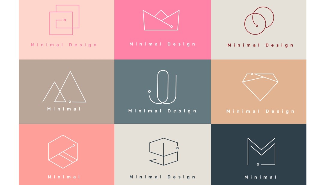
Minimalism didn't happen by accident. Three forces pushed it.
Screens got smaller and more numerous. A logo now has to work as a 16-pixel favicon before it ever gets to work as a billboard. Attention spans got shorter, and research on brand recognition puts the window for telling logos apart at just a few seconds. Global expansion made low-detail marks easier to read across languages and cultures, since a shape travels better than fine print does.
Put simply: a minimalist logo trend, in the functional sense, is minimalism applied around one specific idea rather than used as decoration. If you want the full breakdown of what actually makes a logo count as minimalist, characteristics, examples, when to use one, we've covered that in depth already.
If you're still working out what actually makes a logo minimalist versus just simple, our guide walks through the five traits, real examples made with Zoviz, and famous cases like Nike and FedEx.
Read it here: What Is a Minimalist Logo? Examples and When to Use One
What's actually changing in the minimalist logo trend this year
Here's what 2026's trend reporting is actually saying.
Kittl's 2026 design trends report points to commentary calling recent high-visibility rebrands "unremarkable," part of a broader rise in safe, forgettable branding. Creative Bloq has run multiple pieces this year arguing the minimalist logo trend is making brands blend together, spreading from fashion into tech.
Shopify's 2026 logo trends coverage goes further. It argues design is actively swinging back toward chunkier typefaces, tapered letterforms, curvy linework, and asymmetry, a reaction to a decade of flat, minimal, app-icon-style branding.
None of that is an argument against minimalism. It's an argument against the shortcut version of it, the one where "minimal" means "generic" instead of "edited down to one strong idea."
A few things are happening at once:
- Typography is getting bolder. The clean geometric sans that every fintech app leaned on around 2022 is losing ground to chunkier, more distinctive letterforms.
- Asymmetry is replacing perfect balance. Brands want a logo you can describe in one sentence and still tell apart from a lineup of competitors.
- Motion is built in from the start. Logos are designed to work as a few frames of animation on a loading screen, not just as a static mark.
The brands still winning with minimalist logos, and why it's not the same trick
Hinge's capital H, built from two strokes shaped like clasped hands, still reads as an idea and not just a shape. That's the actual difference between minimalism that ages well and minimalism that doesn't. The mark has to say something specific.
Stripe kept its wordmark undecorated because the product is undecorated too. No serif, no flourish, just clean type that mirrors how transparent the company wants its payment infrastructure to feel. Copy that formula onto a brand that isn't actually that plain, and it reads as empty instead of confident.
Peloton's icon is a simple geometric mark that suggests motion, which works because the company sells motion. Drop that same icon onto an unrelated business and it stops meaning anything.
Calm uses a soft, lowercase wordmark that mirrors the tone of the product itself. It's not simple because simple is trendy. It's simple because a meditation app shouting for attention would be its own contradiction.
Monzo's coral geometric icon reads instantly on a phone screen, which is exactly where a challenger bank's app icon needs to work hardest.
The strategy behind flat, minimalist branding didn't disappear just because the trend is getting more competition. Our guide breaks down why brands made the switch and what it signals to customers.
Read it here: Why Modern Brands Are Choosing Flat & Minimalist Logos
When a minimalist logo works against a brand
Not every rebrand into minimalism has landed well. Burberry brought the knight back onto its crest after simplifying its logo drew criticism for losing brand recognition. Kia's redesigned wordmark has been called out by designers for legibility problems at small sizes, the exact test minimalism is supposed to pass.
The lesson isn't that minimalism is risky. It's that trading away a brand's specific visual memory for a generic clean look can cost more recognition than it gains.
Heritage and luxury brands face a different tradeoff entirely. A logo loaded with decades of earned meaning can carry more complexity than a three-year-old startup ever could, because customers already know what the extra detail stands for.
If your brand runs on warmth, story, or craftsmanship rather than speed and scale, a stripped-down mark can undercut the exact thing that makes people choose you. Weighing a redesign either way is its own decision, and it's worth reading up on when and how to refresh a logo before committing.
Color does most of the emotional work before anyone reads your name, but the right one changes by industry. Our guide breaks down what each color actually signals, with hex codes and real brand examples to start from.
Read it here: Best Colors for a Business Logo (and How to Pick Yours)
What's next for the minimalist logo trend?
Expect three things to keep gaining ground through the rest of 2026:
- Bolder, more distinctive typography. Chunky letterforms, tapered strokes, and asymmetric layouts are replacing the generic geometric sans that felt safe a few years ago.
- Responsive, motion-ready marks. A logo now has to work as a still image and as a few frames of animation, so brands are designing for movement from the start instead of bolting it on later.
- Selective ornamentation. Nature-inspired accents, warmer color pairings, and small decorative details are showing up on brands that want to feel premium without going back to the cluttered, gradient-heavy logos of the 2000s.
None of this undoes minimalism's core lesson. It just means the bar for a "clean" logo now includes being memorable, not only being simple. For a wider look at where different logo styles sit on that spectrum, our guide to logo styles and design ideas is a good next stop.
Curious what the process actually looks like end to end? This walkthrough follows one founder building a minimalist logo in Zoviz from scratch, business name to full brand kit, in under 30 minutes.
Frequently asked questions
Is the minimalist logo trend dying in 2026?
No. It's splitting. Generic, interchangeable minimalism is getting called out by designers and trend reports, but minimalism built around one specific idea is still the standard for brands that need to scale across screens.
Why did so many brands switch to minimalist logos?
Three reasons stack up: smaller screens demand marks that hold up at a few pixels, shorter attention spans reward instant recognition, and global brands need a look that reads clearly across languages and cultures.
What's replacing minimalism in logo design trends?
Nothing is fully replacing it. Bolder typography, asymmetry, and motion-ready design are layering on top of minimalist foundations, especially for brands trying to stand out after years of near-identical clean logos.
Will minimalist logos look dated in a few years?
The specific ones won't. Logos built around one clear idea, like Stripe's plain wordmark or Peloton's motion mark, don't date the way trend-chasing shapes do. Logos that copied a template without a real idea behind them are the ones at risk.
Should I still choose a minimalist logo for my brand in 2026?
If your brand needs to scale across app icons, social profiles, and print, yes, with one condition: the mark needs a specific idea behind it, not just fewer elements. If warmth or heritage is your main appeal, a fuller identity might serve you better.
Recibe boletines exclusivos
Suscríbete ahora para recibir las últimas novedades directamente en tu correo. ¡No te lo pierdas!
Recomendado para ti


Prueba el creador de logotipos de Zoviz
Ingresa el nombre de tu marca y obtén opciones de logotipo en segundos.

