
What is a Monogram Logo? How to Create One

Human beings tend to see letters first, over and above images. It is why monogram logos are such an intelligent form of creating a powerful first impression.
Just consider the double c of Chanel, or the overlapping L and V of Louis Vuitton, or the lettermark of HP. These are not only fashionable shapes. They are confidence, class, and lasting identity.
An intelligent monogram logo design will make your brand appear through its initials. It simplifies branding and makes your audience remember your name. It is in this guide that you will know these logos, the reasons why they are used by the brands or companies, and how to make a monogram logo for your business.
Table of Contents
- What Is a Monogram Logo?
- Why Brands Still Choose Monogram Logos
- What Makes a Monogram Logo Special?
- Best Fonts and Styles for Monogram Logo Design
- How to Create a Monogram Logo Step by Step
- Best Tools to Make a Monogram Logo
- Inspiring Monogram Logo Examples
- Final Thoughts
What Is a Monogram Logo?
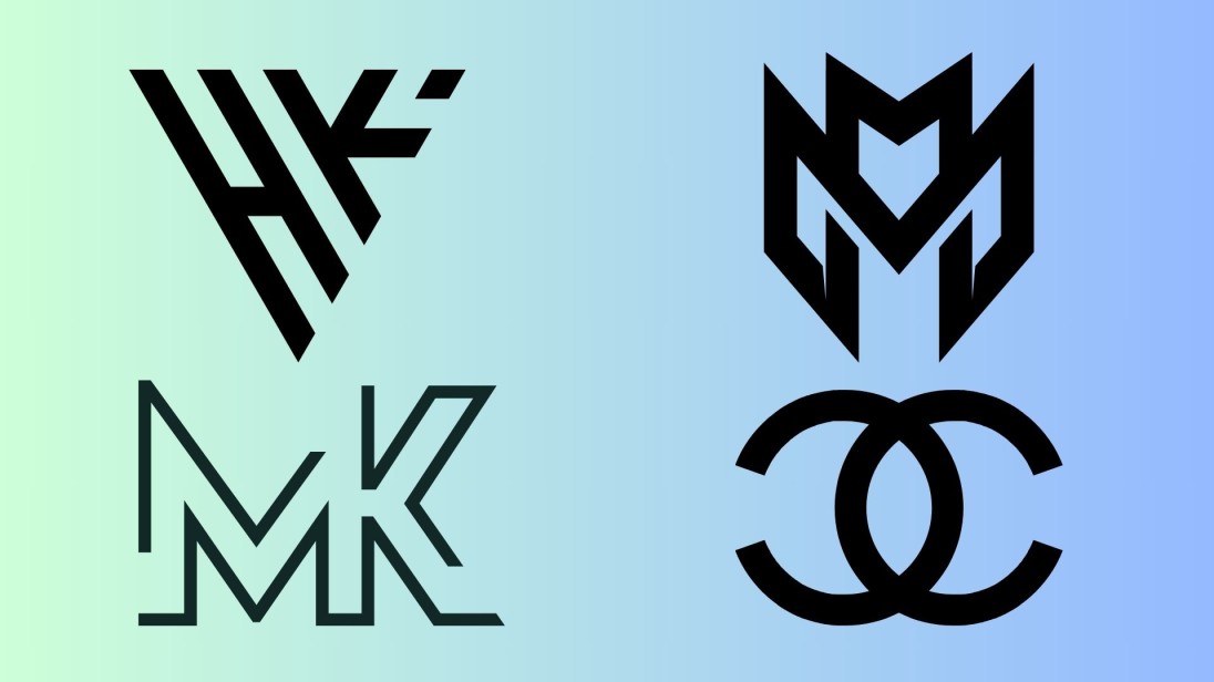
A monogram logo is a unique type of logo created by matching one to three letters, generally the initials of the brand. It can have a strong meaning despite being one of the most basic styles of logos.
These logos are clear, detailed, and simple to use on any platform. They can be embroidered on cloth, watermarked, printed on a package, or have any number of other uses, but they work because they are flexible and instantly recognizable.
In case you are just setting up business and need something that is smooth and will be remembered, this style might just suit you. It is common behavior among many entrepreneurs to generate monogram logos of the brand when they want to show an elegant and retro-styled initial impression.
Why Do Brands Keep Choosing Monogram Logos?
Easy to Remember, Hard to Forget
Initials are a simple and accessible means of making people remember your brand. Lots of companies do this so that their name can be remembered without the full writing.
An excellent monogram logo is outstanding, and it makes customers connect it to your business immediately.
Elegant Style Made Simple
This form of logo appears neat and elegant. It stands out, no matter what business you are in, and is fashionable yet professional, and does not have a complex feel to it.
One Design That Fits Everywhere
The most awesome thing is? You are able to fully regulate the outcome of your monogram logo design. Decide on the connection between letters, the font, the spacing, and the overall shape. It looks beautiful on business cards, websites, signage, and packaging.
What Makes a Monogram Logo Special?
Whether you use a logo monogram maker or one you make by yourself, target these features to create a logo that is memorable and unique to use:
Your Letters Take the Spotlight
The brand initials focus on you. The two or three letters, whichever usage you prefer, must be sharp, bold, and readable in any size.
Font Style That Speaks for Your Brand
The influence of fonts is enormous. Serif fonts are elegant, sans serif fonts are modern, and script is soft. The style you use predetermines your trust.
Smart Layout and Letter Pairing
A lot of nice monogram logo designs are symmetrical or creatively overlapping letterforms. That way, the design appears more integrated and centered.
Less Color, More Focus
The majority of monograms remain black, white, gold, or single core brand color. It is simple and keeps the emphasis on the letters and facilitates printing over all media.
Spacing That Looks Just Right
Spacing is important even when you use bold fonts. The right letter spacing helps your initials stand out and leave a clean look.
Best Fonts That Work Great in Monogram Logos
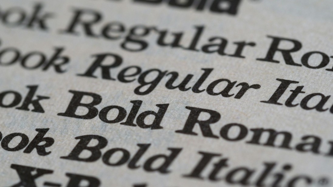
The type of font you use is how your logo will feel. The following styles are suitable when it comes to monogram logo design:
Serif Fonts Feel Rich and Reliable
Suitable for brands that are luxurious and renowned. They exude status, orderliness, and formality.
Sans Serif Fonts Keep It Clean and Crisp
Sans serif fonts are clean and crisp Sans serifs fonts are clean and crisp
This design is suitable for clean and contemporary branding. These fonts are simple and business-like, perfect for technology or business applications.
Script Fonts Add a Touch of Personality
In case you prefer a more intimate, gentle touch, you could use script fonts perfectly. They are awesome when it comes to handcrafted, artistic, and event-based businesses.
Mix Fonts to Add Visual Interest
Experiment with types of fonts. E.g., a serif will be used on the first letter and a sans serif on the second one. It provides the logo with contrast, enhancing its personality.
How to Make Your Monogram Logo Step by Step
If you're wondering how to create a monogram logo, follow these steps:
1. Choose the Right Initials
Choose 2-3 letters that will be the brand name. These are the basis of your logo, so be sure to make them memorable and easy to read.
2. Match the Font to Your Brand Personality
Feeling adventurous or classy, or flirty? That should be captured in your font choice. Use sans serif to have a modern touch. Serif is good when it comes to something formal. To have a more imaginative appeal, a script font will serve the purpose.
3. Try Simple Layouts and Shapes
Stack, set side by side, or interlock the initials to see how they look together. You may also make use of such shapes as circles or squares with which you can frame your letters and make it a complete logo.
4. Use a Free Logo Maker to Preview Your Design
You do not have to be a designer. It is possible to experiment with the monogram logo online tools. After this, you are able to download your logo in high quality.
Top Tools to Design a Monogram Logo Online
These tools help you make a monogram logo that looks polished without needing design skills. They also support SEO needs with optimized outputs.
Zoviz
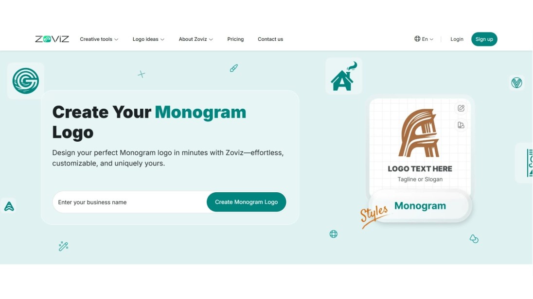
Zoviz is one of the best monogram logo maker platforms for creating professional results. It is possible to type in your brand name first, and the site will generate monogram combinations according to your taste. Select the spacing of letters, color, shapes, and fonts.. Zoviz also gives you a complete branding package for social media, business cards, and print materials.
Canva
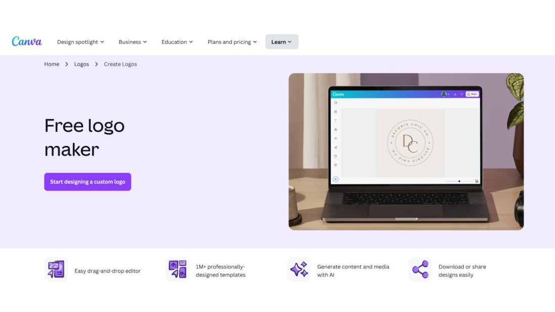
Canva is a simple design tool with a large choice of monogram logo design templates. Drag and drop items, select your fonts, and apply filters with no trouble. Branding kits and templates are also available so that you maintain consistency in your visuals.
Looka
At Looka, you may create a monogram logo in several minutes with the help of their intelligent brand builder. Just answer several questions and obtain free logo ideas. Looka provides you with customizable files and branding services, which are in line with the existing SEO and marketing trends.
DesignEvo
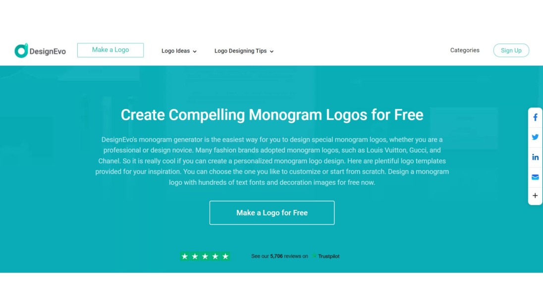
DesignEvo is a free monogram logo maker with thousands of templates. Decorate any template with your initials, modify colors, fonts, and icons. It is a fast route to make a monogram logo that is outstanding.
Adobe Express
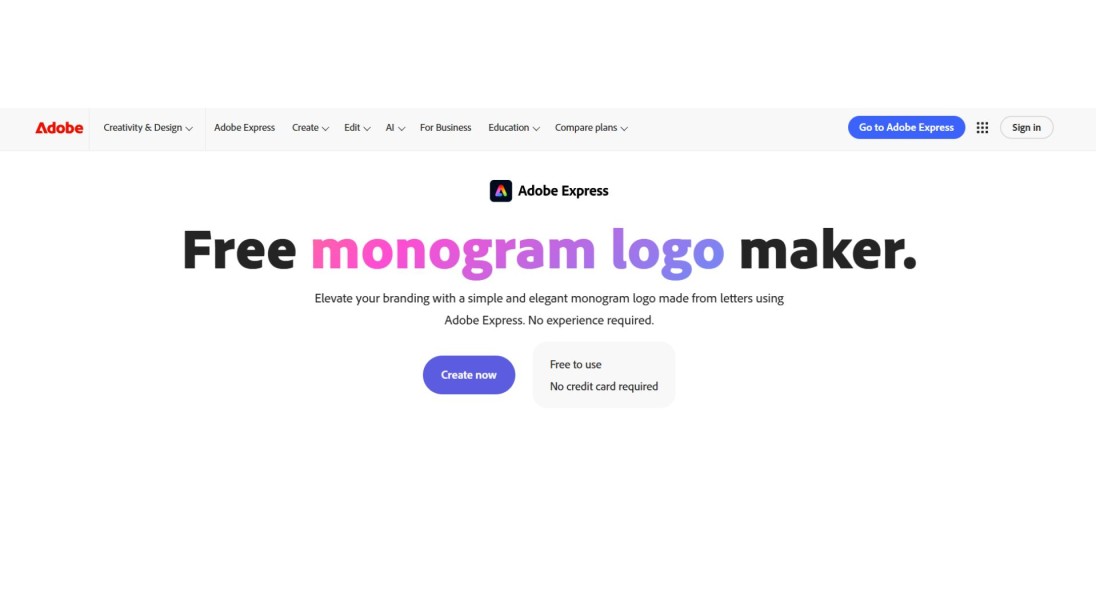
In Adobe Express, you have the liberty to generate monogram logos either from scratch or through their templates. Powerful editing tools and lovely font options make it ideal for people who do not intend to spend their time studying complex software, but rather have creative control.
Monogram Logos That Got It Right
Chanel
The trademark sweater has a double C, which reflects Coco Chanel. It is an iconic, simple, and elegant one. The reflection presented in the mirror is harmonious and posh.
HP
HP is represented by two strong fonts in a plain circle. It is a legible yet functional design that is friendly to technological devices, even when it is of small size.
Louis Vuitton
The LV overlap is fancy and eternal in the style of serifs. It has a proprietary style printed on all the bags, boxes, and tags.
GE (General Electric)
GE employs the script in a circular block. It makes it personal even though it remains corporate and clean.
Final Thoughts
Monogram logos are not only design trends. They create identity and leave an eternal dent.
Depending on whether you have a bold logo, minimal, traditional, or modern, this style of design can be tweaked to suit. Write in clear initials, determine a good font, test layouts, and review.
In case of time and design limitations, you can consult a monogram logo maker such as Zoviz, Canva, or Looka.
A powerful monogram logo design is not a beautiful picture. It turns into some kind of manifestation of what your brand is all about, simple, eternal, and memorable.
독점 뉴스레터 받기
최신 소식을 이메일로 바로 받아보려면 지금 구독하세요. 놓치지 마세요!
회원님을 위한 추천


Zoviz 로고 메이커를 사용해보세요
브랜드 이름을 입력하면 몇 초 만에 로고 옵션을 받을 수 있습니다.


