
What is a Vintage Logo? How to Design One

People don’t just see logos. They connect with the story behind them.
This is why ancient logos remain outstanding today. Consider Coca-Cola, a flowing script, a classic logo of Levi Strauss, or the bold design of Jack Daniels. These are not just old designs. They hold tradition, trust, and Everlasting style.
A powerful vintage logo design can offer quality and personality to your brand at first sight. It demonstrates to people that your company respects its origins and stands in the present. This guide will tell you what makes a vintage logo great, why so many companies are opting towards this kind of design, and how to create a vintage logo that people will eagerly associate with your brand.
Table of Contents
- What Is a Vintage Logo?
- Why Brands Still Choose Vintage Logo Styles
- Key Features of Vintage Logos
- Best Fonts and Colors for Vintage Logo Design
- How to Design a Vintage Logo Step-by-Step
- Best Tools to Create a Vintage Logo
- Real Vintage Logo Ideas That Inspire
- Final Thoughts
What Is a Vintage Logo?

A vintage logo is a type of logo that makes use of past design components. Just imagine old type, hand-drawn badges, vintage images, and washed-out colors. These logos are based on 1900-1980s styles.
Vintage logo design is effective since it creates nostalgia. It takes people back to the times when everything was easy, sincere, and durable. It helps to make your brand more authentic through that emotional connection.
Why Brands Still Love Vintage Logos
Old Look, Strong Trust
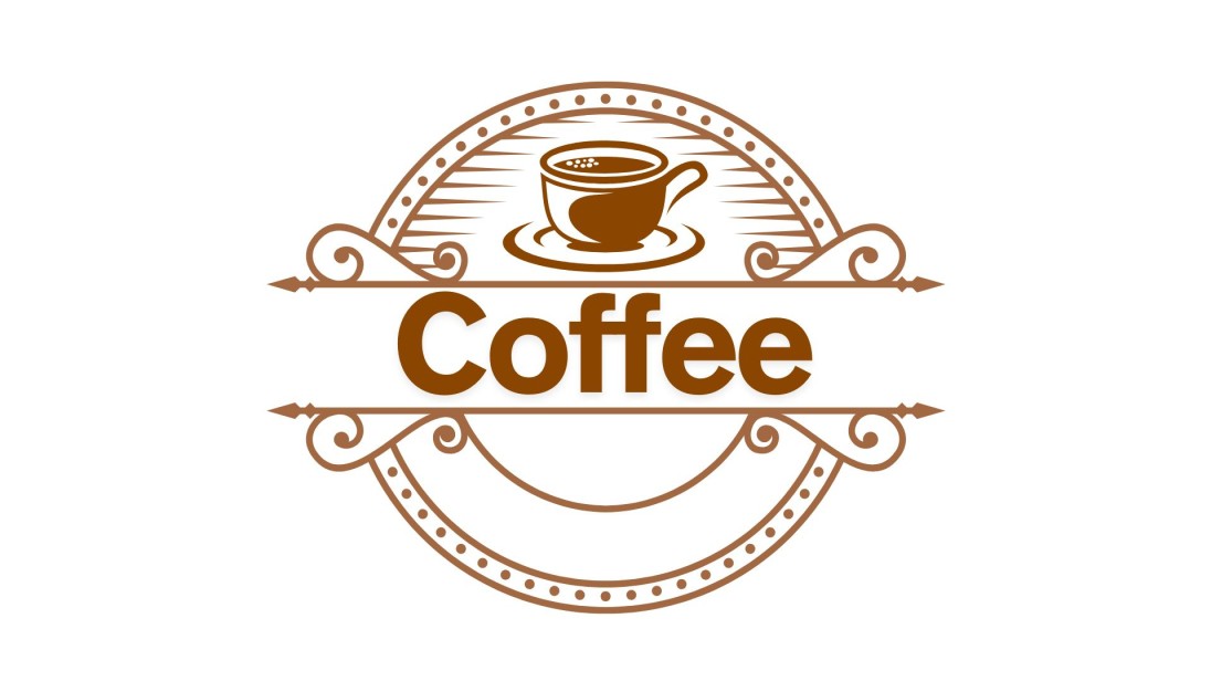
The old logo would make one recall reliable old brands. That is why a lot of companies opt to create a vintage logo in order to establish immediate credibility. It seems cozy, sincere, and familiar, the one that fits connecting with a customer on an emotional level.
Not Boring, Always Bold
The contemporary logos are overly simple. There is a character in an old logo. It allows you to create hand-drawn elements, old-fashioned fonts, and textures, which conveys the story of your brand in a playful and catchy manner using the vintage logo maker.
So Many Cool Ideas to Try
The best of all? The number of vintage logo ideas is limitless. Whether opening a coffee shop or a clothing brand, vintage design lets you be creative and be different from all brands and beaches of look-alikes in the world.
Key Features That Make a Logo Look Vintage

So what is that old-school about a logo? It is a matter of those minor details that provide an Everlasting attitude. When you use a vintage logo maker or collaborate with a designer, seek out these traditional attributes..
Handmade Feel
Vintage logos tend to have a hand-drawn shape and lines. This makes the design personal and handmade-looking, and real and original. It helps businesses that would like to demonstrate their attention to detail and quality.
Retro Fonts
The lettering is very crucial in the case of vintage logo design. Retro fonts, such as bold serif fonts or flowing script fonts, create a nostalgic element. They make people think of newspapers or signage or even product labels of the old days, making the logo more legitimate.
Aged Textures
The logo seems weathered in a positive sense by adding languorous or grainy textures. Such textures make the design look well-worn and loved. The technique is used to produce a lasting impression in many vintage logo ideas.
Soft, Muted Colors
Vintage style does not always go well with bold colors. But rather, consider deep reds, olive greens, browns, and creams. These dull colors are warm, Everlasting, and calm. They build up a harmonious and reliable image of your brand.
Classic Layouts
The majority of the vintage logos adhere to clean shapes, such as circles or badges. These abstract shapes can easily be printed, identified, and recalled. This layout is very good when you need to create a vintage logo, on packaging, as well as anywhere.
A vintage logo is not a style alone. They evoke a memory, communicate an experience, and build your brand into something substantial and memorable.
Best Fonts and Colors for Vintage Logo Design
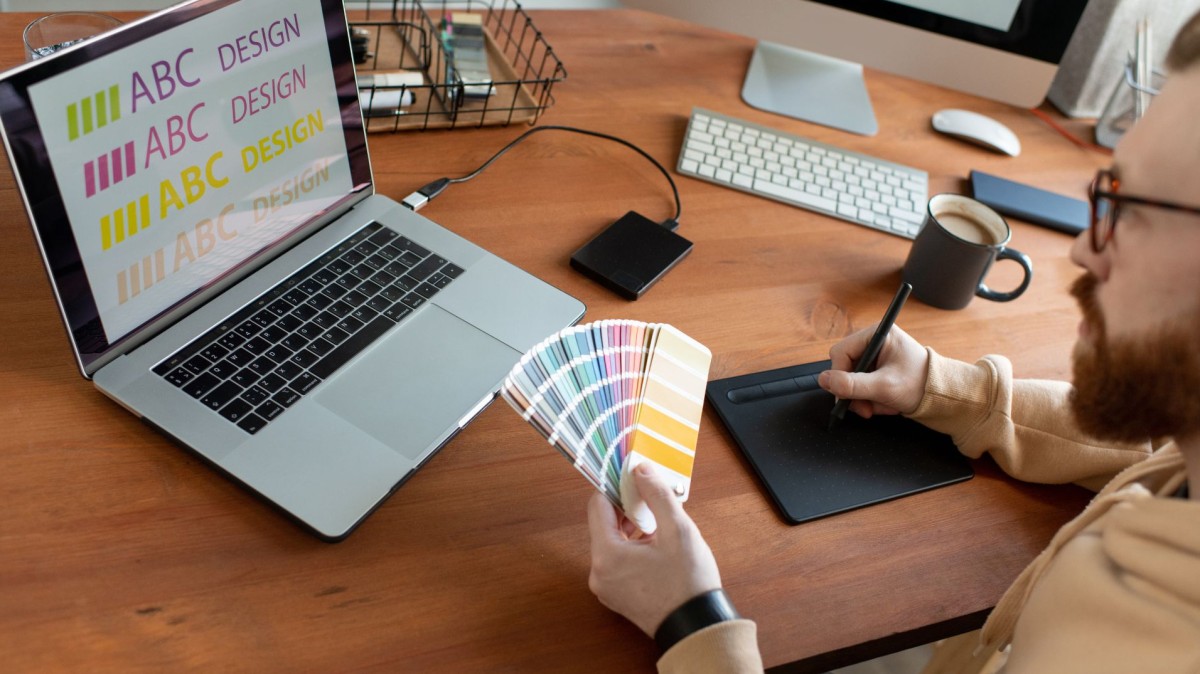
When you are willing to create your custom vintage logo, fonts, and color choice is a significant part of the process. These decisions influence the sense and texture of your logo as well as its brand message.
Best Font Styles
On choosing fonts, choose rather those that can be described as classic yet easy to read:
- Serif fonts are also elegant with details at the edges. These fonts are bold and confident, normally applied in the conventional branding.
- Script fonts create the impression of a handwritten text. They are good for brands that would like to look friendly, creative, or handmade.
- Slab serif fonts are thick and solid. These fonts make a vintage logo look strong and certain when they are applied in the names of businesses.
The wonderful idea is to mix two styles. The brand name should be written in a bold slab serif, and the tagline in a flowing script. This combination is balanced and contrasting with most of the successful vintage logo designs.
Best Color Combinations
Colors are communicative. To have that old-fashioned style, prefer warmer and dulled colors:
- Deep reds and browns are satisfying, weighty, and historical. These colors are common when reflecting tradition, strength, and warmth.
- Muted green or olive brings in a natural color. It suits well those brands that emphasize eco-friendly, organic, or rustic products.
- Cream or off-white can be used as a soft background. The shades support other features to be prominent, and at the same time, not strain the eyes.
- Faded blues create the feeling of comfort and confidence. Blue is a relaxing color, and the worn-out color makes it softer and vintage.
How to Design a Vintage Logo Step-by-Step
In the event you might wonder how to design a vintage logo, it is easy and artistic. It is not only about applying old styles. It is creating something that is Everlasting, believable, and true to your brand.
1. Understand Your Brand Message
Consider what your company is all about. Do you wish your brand to be handmade, bold, or nostalgic? A vintage logo is most effective when it suits your narrative as well as what you believe in.
2. Gather Inspiration That Fits
To be truly inspired, check out vintage logo inspiration in posters, labels, signs, and so forth. This will make you discover the style that best fits your brand, be it elegant, playful, or rustic.
3. Choose Fonts, Colors, and Layout
Incorporate traditional fonts such as serif, script, and slab serif fonts. Pick warm, muted colors such as deep red, olive green, or cream. Such details produce a retro logo design. Vintage feel also contributes to simple arrangements, such as circles or badges.
4. Design and Explore
Start sketching or design vintage logo online using a tool. Online makers help you test different fonts, shapes, and colors without needing expert skills. Experiment to find out which works best.
5. Add Texture and Get Feedback
Your logo may be older and more real with grainy textures or lighting effects. After you like what you have developed, present your design to other people. Assuming that they mention that it feels old-fashioned or crafted by hand, you are headed in the right direction.
Best Tools to Create a Vintage Logo
You do not have to be a professional designer to design a vintage logo. When using the proper tools, anyone will be able to make a logo that will seem Everlasting, trustworthy, and personal. Such websites provide quick editing, gorgeous vintage logo templates, and options that make your brand unique.
Zoviz
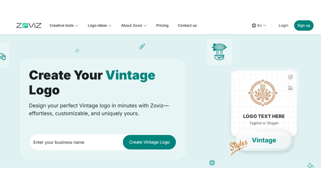
Zoviz is one of the best vintage logo generators on the market. It is witty, quick, and simple. It only takes a few seconds; you only need to leave your brand name and choose your style, and Zoviz will create special vintage logo ideas that will suit your brand. You can adjust colors, fonts, and icons with just a few clicks. The toppermost? Zoviz provides you with a complete branding kit, including logos, business cards, and graphics for social media. It is an excellent option in case you need to create a vintage logo that seems professional and polished.
Canva
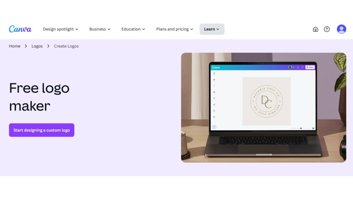
Canva is ideal in the case of amateurs who need creative power without having to struggle with complex elements. It has a wide variety of vintage logo templates that can be edited. You can change colors, mix fonts, add icons, and experiment with layouts. The user interface of the Canva editor on drag-and-drop is straightforward, and a lot of options are free of charge. It is best suited to small business owners/ hobbyists who want inexpensive, fast, and slick results.
Adobe Express
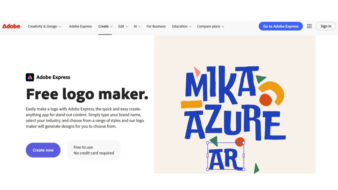
Creating a design is more flexible in Adobe Express, but remains very much beginner-friendly. It provides retro fonts, backgrounds with texture, and retro symbols that will make your logo have character. Adobe Express allows you to design a high-quality project using their free templates or a blank canvas, and the end product will look exceptionally custom and clean.
Looka
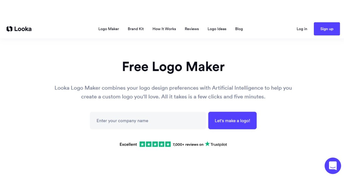
Looka creates logos depending on the style and personality of your brand. Upon responding to some simple questions, Looka provides you with a variety of options, selecting logos that include classic and retro logo designs. You can then tweak the colors, fonts, and layout to make it fit your brand. It is an excellent selection when you are interested in viewing the variety of ideas quickly and making one appropriately yours.
Real Vintage Logo Ideas That Inspire
Before designing your own logo, it is interesting to look at famous companies that apply vintage elements to form recognizable visual identities. All these examples demonstrate that a simple and careful logo can live through decades.
Levi’s
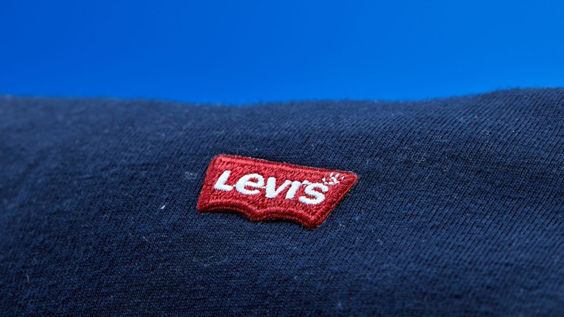
The Levi logo is very bold, clear, and recognizable at a glance. Its application of red color and simple font says more about strength and dependability without telling more.
Jack Daniel’s
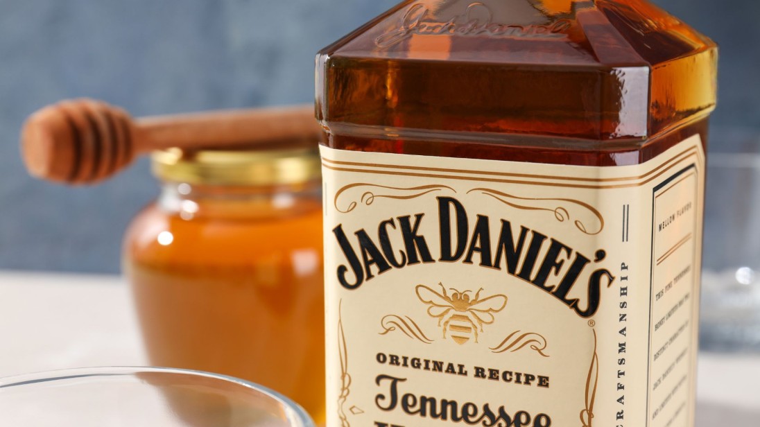
These characteristics of Jack Daniels include fancy script and decoration, a black and white color theme. It is traditional and the art of ages, so the design seems familiar and trusted.
Coca-Cola
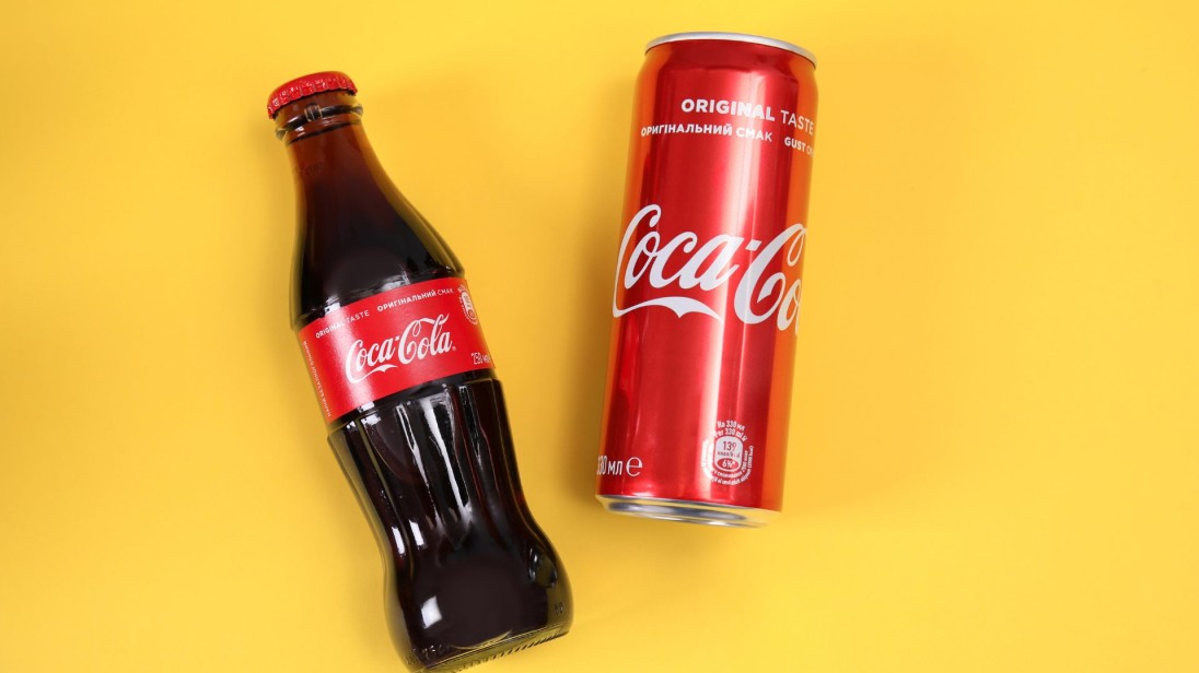
The following Coca-Cola script and the red color remained unchanged throughout the lifetime of Coca-Cola for over one hundred years. It has been very consistent to the extent that it is one of the most globally familiar logos.
These facts confirm that vintage design is not just a fashion. It makes people emotional, it narrates a story, and it finds a way to deal with people who resonate with them.
Conclusion
A logo done by Everlasting is more talkative than a tagline ever was. Modern designs keep changing to follow fashion, whereas vintage logos aim at being memorable.
When you are intending to design, start with a brand message. Adopt a simple layout, conventional fonts, and warm color shades to exude a sense of personality that is behind your business.
Spend some time examining some ideas and put them to the test. And, in case you would like to do it quicker and want your dream to become a reality, an online logo maker such as Zoviz will enable you to proceed without having design skills.
The vintage logo that has been done well is not merely viewed. It is eternal, believable, and reputable.
Özel bültenleri alın
En yeni güncellemelerin doğrudan e-posta kutunuza gelmesi için hemen abone olun. Kaçırmayın!
Senin için öneriliyor


Zoviz Logo Yapıcıyı Dene
Marka adınızı girin ve saniyeler içinde logo seçenekleri alın.

