
Your brand needs a logo which presents itself as delicious because it serves as the initial taste experience through which viewers connect first to your brand identity.
It tells your story. It stirs hunger. Your business food establishment gains long-term recognition through this visual element.
But here’s the challenge:
How does your dilemma stand among thousands of eateries and bakeries with gourmet brands operating in the market space?
An effectively thought-out logo becomes the starting point for finding the right answer. All logos create visual effects as they range from classic bakery signs to clean modern symbols that power delivery app services.
This article covers all aspects related to the importance of logos and presents you with the best online logo design tools. Your goal should be to make your food brand identity as appetising as your restaurant cuisine.
The guideline provides both logical instructions and artistic direction for your projects, regardless of their launch type.
Table of Contents
- Why Logo Designs Matter in the Food Industry
- 20 Creative Food Industry Logo Design Ideas
- Logo Ideas by Food Industry Type
- Practical Logo Design Tips (With Examples)
- Best Tools for Online Logo Design in 2025
- Logo Design FAQ
- Final Thoughts
Why Logo Designs Matter in the Food Industry
The food business depends entirely on sensory experiences, including sight, smell, and taste.
Your logo taps into the first one: sight. A good logo enables customers to experience visually what their dining experience will be.
An outstanding food logo fosters trust among customers and immediately arouses their culinary desires to establish meaningful emotional bonds with your audience.
Your logo needs to convey all brand details in a single glance regardless of whether your operation is a café setting, pizza chain or health-specialized business.
Customers will remember your logo because it integrates itself into their memory. The brand logo appears throughout packaging, signage, menus, and social media platforms.
An effective brand identity communicates about the brand even in situations where the actual product is not present.
People recognise your business in an instant through your branded visual sign which provides both menu information and delivery method.
The distinction between being seen by customers or overlooked in the current competitive market depends on the strength of your logo.
20 Creative Food Industry Logo Design Ideas

Here are fresh ideas when creating a new logo or updating an existing one:
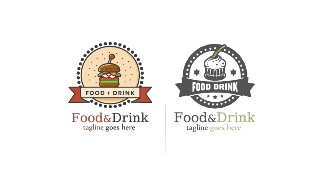
Retro Diner Vibes
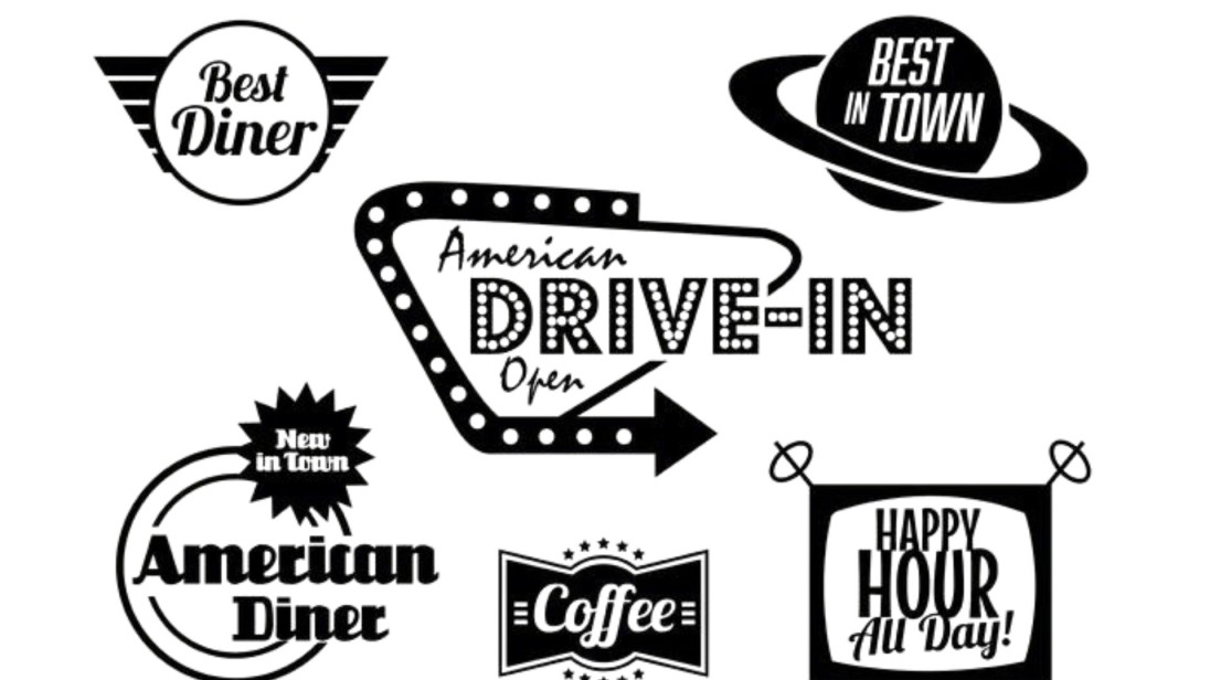
Retro Diner Style Comes From 50s Retro Typography and Icon Designs.
Minimalist Cutlery
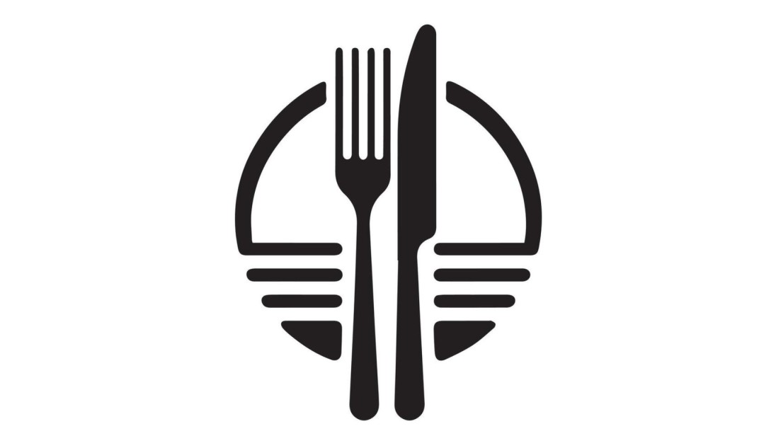
Drawn with basic lines are the minimal cutlery work pieces like forks, spoons and knives.
Nature-Inspired
The Graphic Design Style Encourages Eco Themes From Leaves to Soil Examples.
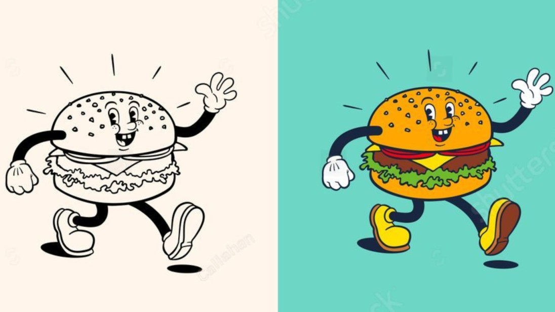
Cute Mascots
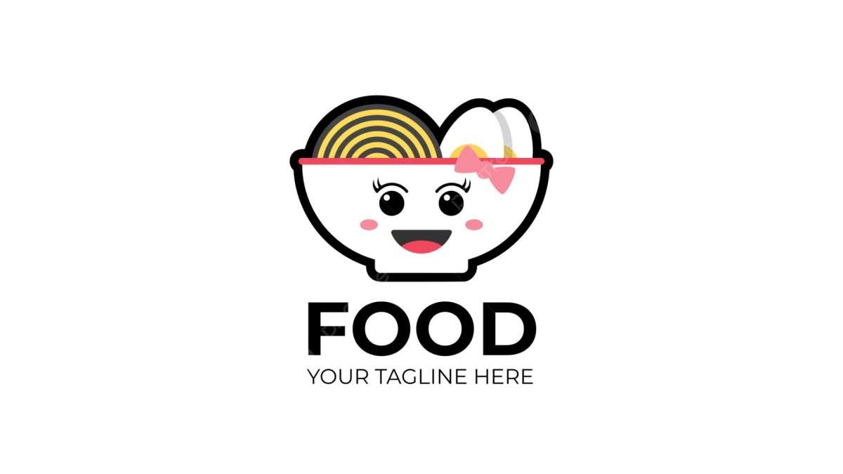
A joyful doughnut grin faces a sandwich smile, and fruit winks.
Handwritten Fonts
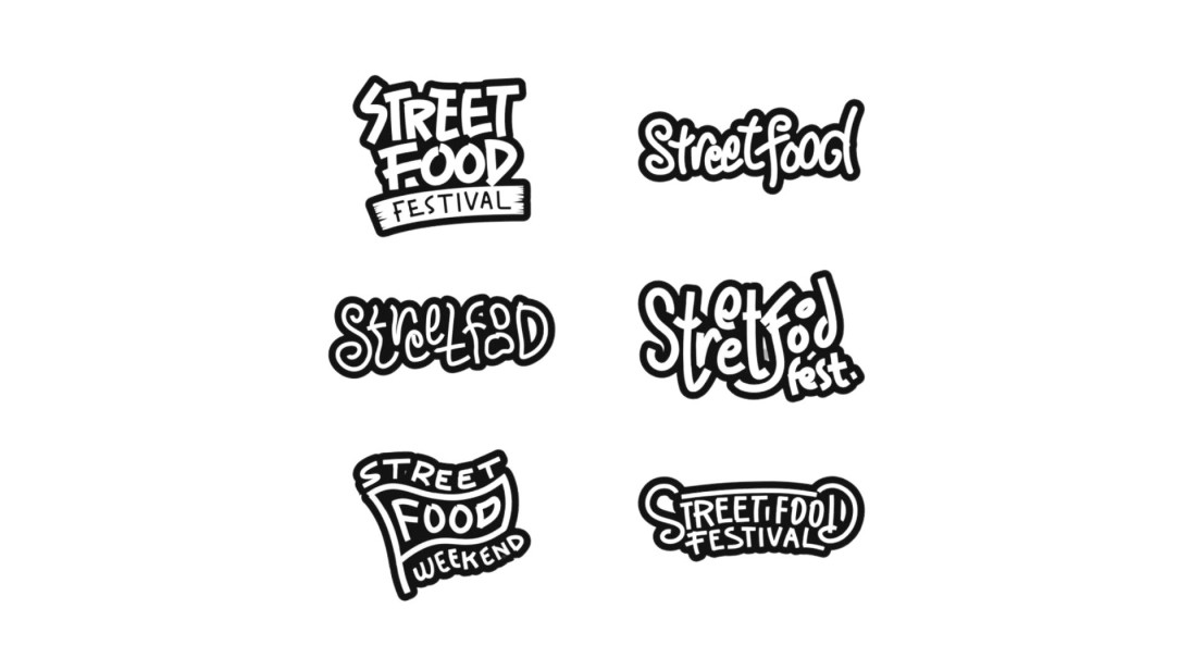
A handwritten typeface brings out honey and comfortable feelings.
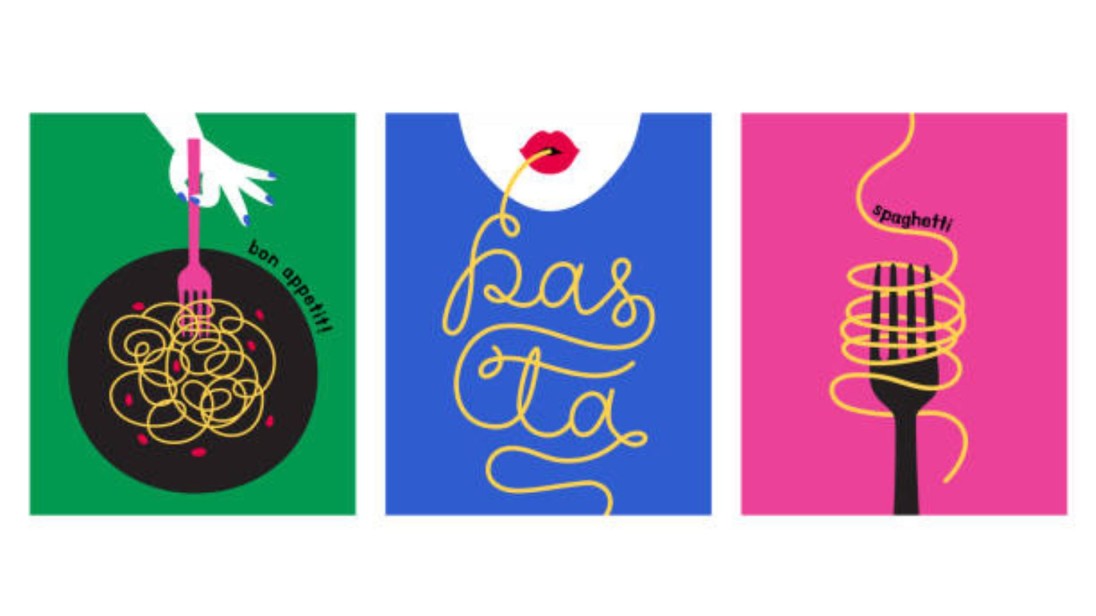
Geometric Shapes
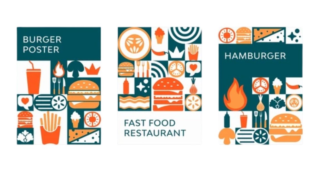
Basic Geometric Designs Form in Both Sliced Pizza and Stacked Burgers.
Traditional Badge Style

Traditional Breastplates with Curved Edges and Tassels Followed Past Art.
Food Fusion Icons

Design combinations of food items to create neurotic representations
Bold Typography Only
No icon, just strong letters.
Watercolor Logos
Soft tones that feel artisan and elegant.
Negative Space Icons
Hidden imagery inside shapes.
Cute Doodles
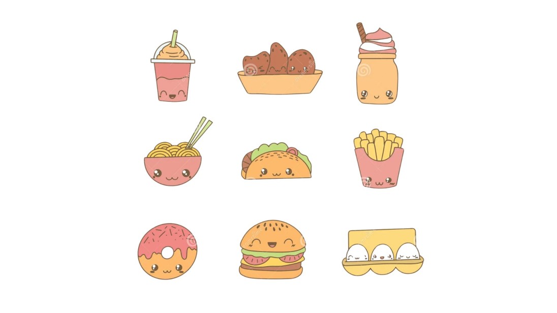
Simple sketches that feel playful.
3D Effects
Logos that pop with shadowing.
Classic Crest Logo
Good for premium or family-owned brands.
Slogan Under Logo
Reinforce the message in a few words.
Chalkboard Style
Perfect for cafés or bakeries.
Color Pop
Be distinct by using intense one-color backgrounds.
Animated Versions
Use subtle motion on digital platforms.
Logo with a Bite Mark
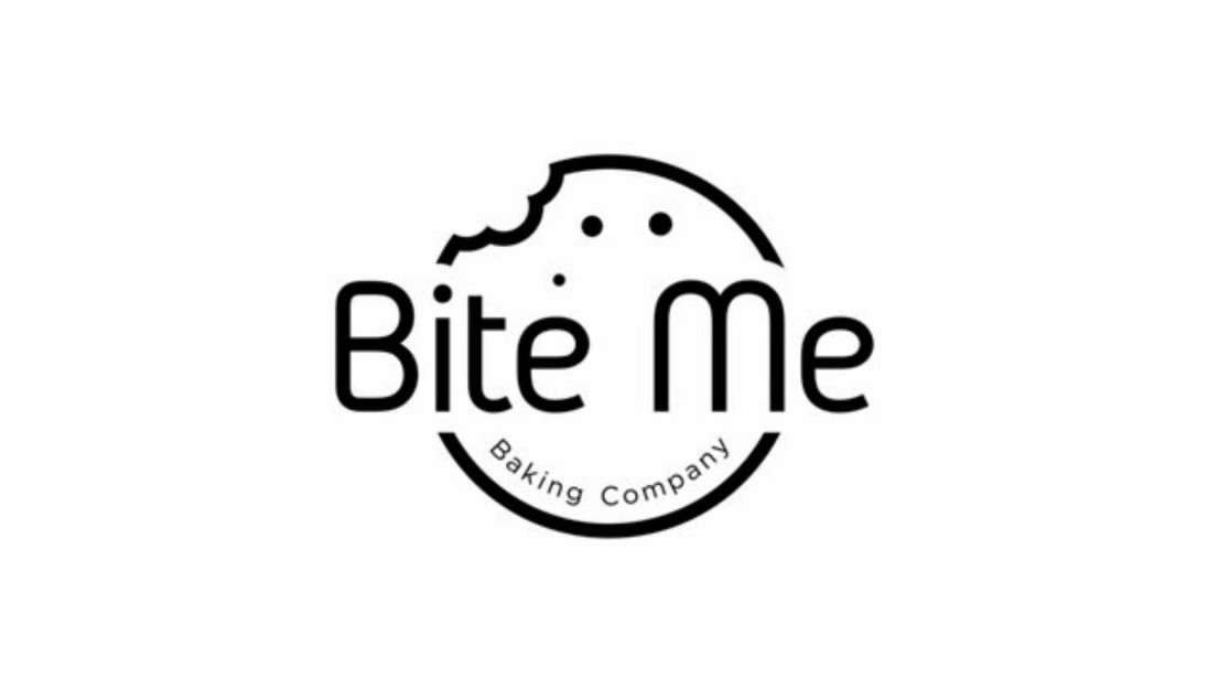
Clever and food-relevant.
Icon in the Letter
Burger as the "O" in your name.
Within these logo design ideas, you have various choices between whimsical and casual styles and fashionable and formal styles to align with your brand persona.
The wheel does not need total reinvention because minor alterations of colour or icon placement can produce substantial visual changes.
Start using these designs as inspiration before developing personal elements that will create your own distinctive logo.
Your brand's spirit needs to shine through in the logo which also must remain usable in different sizes and easy to keep in memory.
Logo Ideas by Food Industry Type

What type of presentation best matches a particular business depends on the kind of food operation. The design process for logo ideas requires following specific approaches according to industry type:
Fast Food
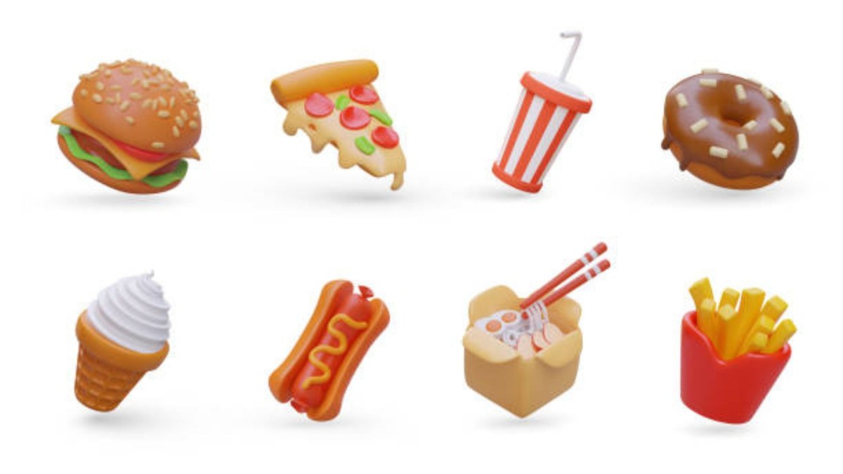
Go for bold colours and round fonts. Keep it energetic and fun.
Three appealing colours, namely red and yellow together with orange, can actively stimulate appetite and grab viewer's attention swiftly.
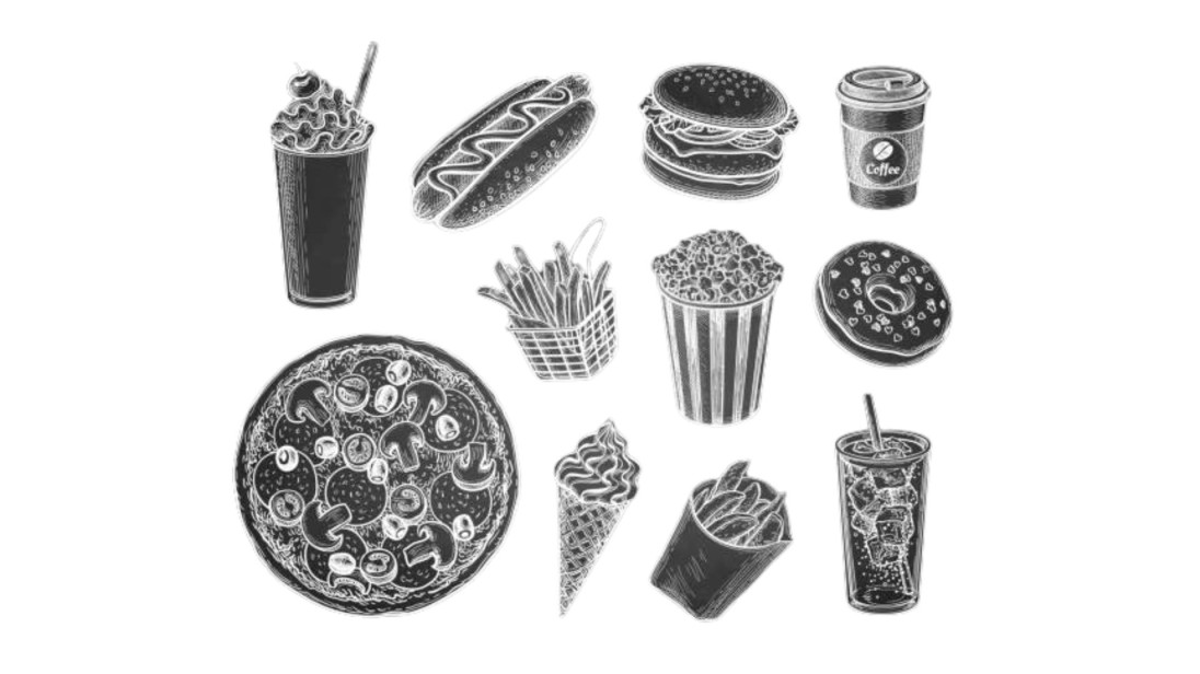
To maintain a playful look, add exciting shapes and basic symbols of food items like burgers, fries, and soda cups.The goal focuses on establishing easy recognition, followed by a relaxed atmosphere through design.
Fine Dining
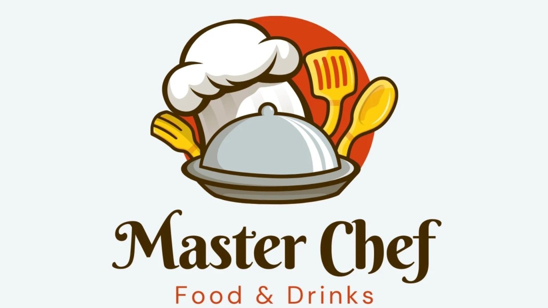
The design should include elegant fonts and minimalistic icons, as well as sophisticated colour tones, such as black, gold, and deep red.
The application should display sleek forms with serif typefaces while maintaining a minimalist design to symbolize both class and exclusivity.
Minimalism stands as the foundation when building trust, along with high-end appeal since clutter distracts from both goals.
Additional luxury is achieved through monogram designs or delicate patterns.
Organic Brands
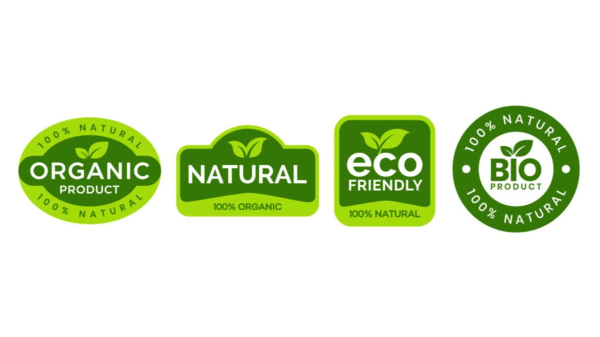
Fusing greens and browns with leaf and farm motifs results in a rejuvenating effect.
Natural-feeling fonts are an excellent branding choice since they may include rustic or hand-drawn styles.
Add health-focused symbols, such as plants, water droplets, and sun rays, to represent sustainability.The design needs to remain earthly to attract customers focused on sustainability.
Bakeries
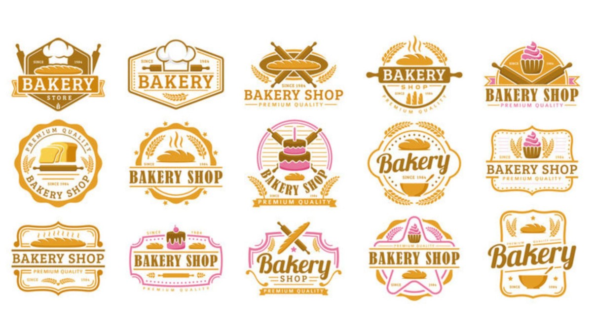
Script fonts, together with pastel colour shades, create a comforting atmosphere.
The addition of rolling pins, cupcakes and whisks can establish a sentimental charm to your design. The logo design should create a welcoming atmosphere that reacts to fresh-baked bread scents.
The comfort factor receives an enhancement through round shapes along with curves.
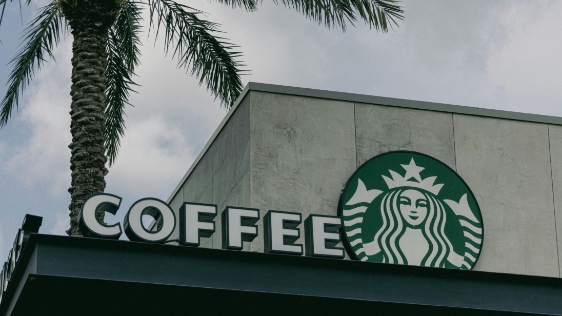
Coffee Shops
People find comfort in visual elements that showcase earth-coloured logo designs together with imagery of mugs, beans or steam patterns.
Hotter browns along with creams and warm oranges, represent the smooth and rich quality of roasted beans.
The design preferences between vintage and modern principally determine which minimal cosy concept you should choose.Visualise your brand logo across physical items such as merchandise and signage, as well as cups and coffee paraphernalia.
A business must select its logo according to its target industry. The logo that succeeds in burger operations cannot perform equally well in a luxury dining establishment.
You must use distinctive colours, fonts and specific icons to show street food atmospheres or five-course dining levels.
The selection of the logo requires a thorough examination of its presentation within different distribution points, which include social platforms, print materials, and staff uniforms.
When your logo stays consistent with your business sector and listenership, it grows increasingly robust.
A logo needs to naturally extend the essential features of your menu with your restaurant's surroundings and service delivery methods.
Practical Logo Design Tips

Designing a logo isn’t just about picking colours or icons. Here’s what actually works:
- Keep it Simple – The design should remain straightforward because many colours and complex shapes would weaken the effect. A basic logo design promotes better recognition among viewers. The successful brands Nike and Apple represent some schools of thought because they adopt straightforward, minimalistic approaches to their designs.
- Make it Scalable – Your logo needs to succeed at any size starting from a business card up to a billboard.The symbol should undergo multiple size tests to confirm its ability to maintain clear visibility. The design quality of a logo must remain visible both at tiny dimensions and at large ones.
- Test in Black and White – Without colour, a design should retain its strength which indicates strong performance. Your design will function effectively without colours because it avoids using colour as its sole meaning channel .The effective logo maintains its impact after being reduced to black-and-white format or faxed copies.
- Choose Fonts Wisely – The decision to use script fonts should be based on the specific theme, as a bakery script works but not for steakhouse branding. Select a font choice that demonstrates your brand persona because it must match your business tone. Verify that all text remains easy to read regardless of the viewing size as well as check for text-to-element compatibility.
- Don’t Overdo Icons – A single strong-symbol representation outmatches a combination of five. Several icons applied together would turn your design into clutter which hinders understanding of your message. A comfortable single eye-catching visual enhances both professional presentation and ease of brand remembering.
The advice originates from typical errors that businesses experience while creating logos and provides solutions to prevent them. Your logo will persist if you follow these guidelines, whether you design it by yourself or hire a designer.
Good logos aren’t complicated, they’re smart. They balance creativity with clarity.
A winning logo communicates all aspects of your food such as taste as well as the mood and fundamental elements of the product.
All branding excellence begins with preserving steady continuity because your logo shapes all brand communication.
Best Tools for Online Logo Design in 2025
You never need an expensive advertising agency's assistance to obtain an outstanding logo. Three leading online logo design tools exist for this year as follows:
Zoviz
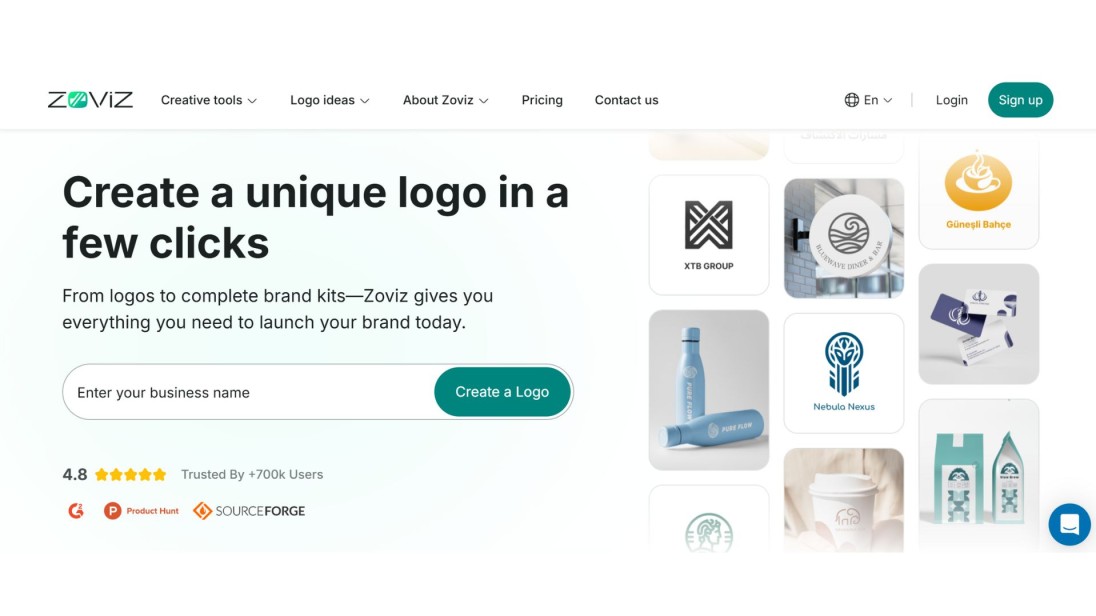
A sleek AI logo generator with professional templates and full brand kits for web and print. Great for modern, minimal designs. The tool lets users see their logo design on various mockups, including business cards, websites and t-shirts, before downloading.
Looka
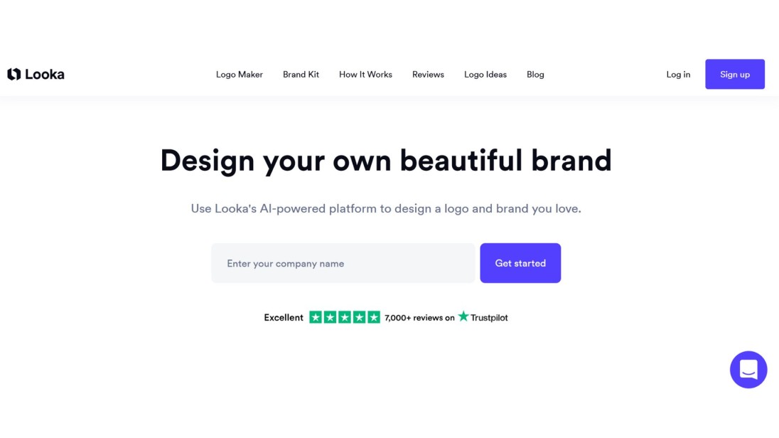
Looka delivers its AI-generated logos through food-optimized templates made for restaurants along with cafés. The service provides business card and social media asset packages as part of its full brand identity package.
Canva
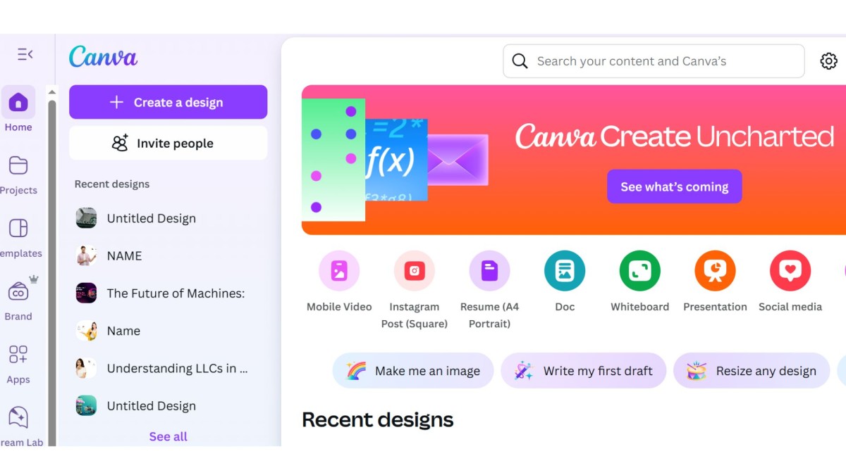
Drag-and-drop design for total beginners, with thousands of customizable logo elements. DIY users can achieve artistic design control through this platform since they lack professional design abilities.
Tailor Brands
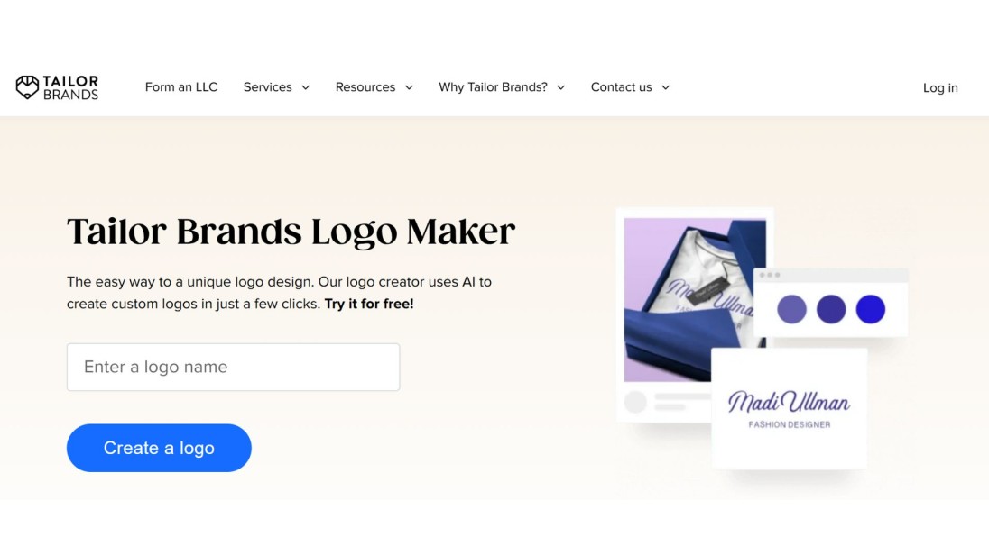
Through its smart logo builder service Tailor Brands enables users to create branding kits and social media tools and business cards. Small businesses receive a complete branding solution through this platform which suits their requirements.
Hatchful by Shopify
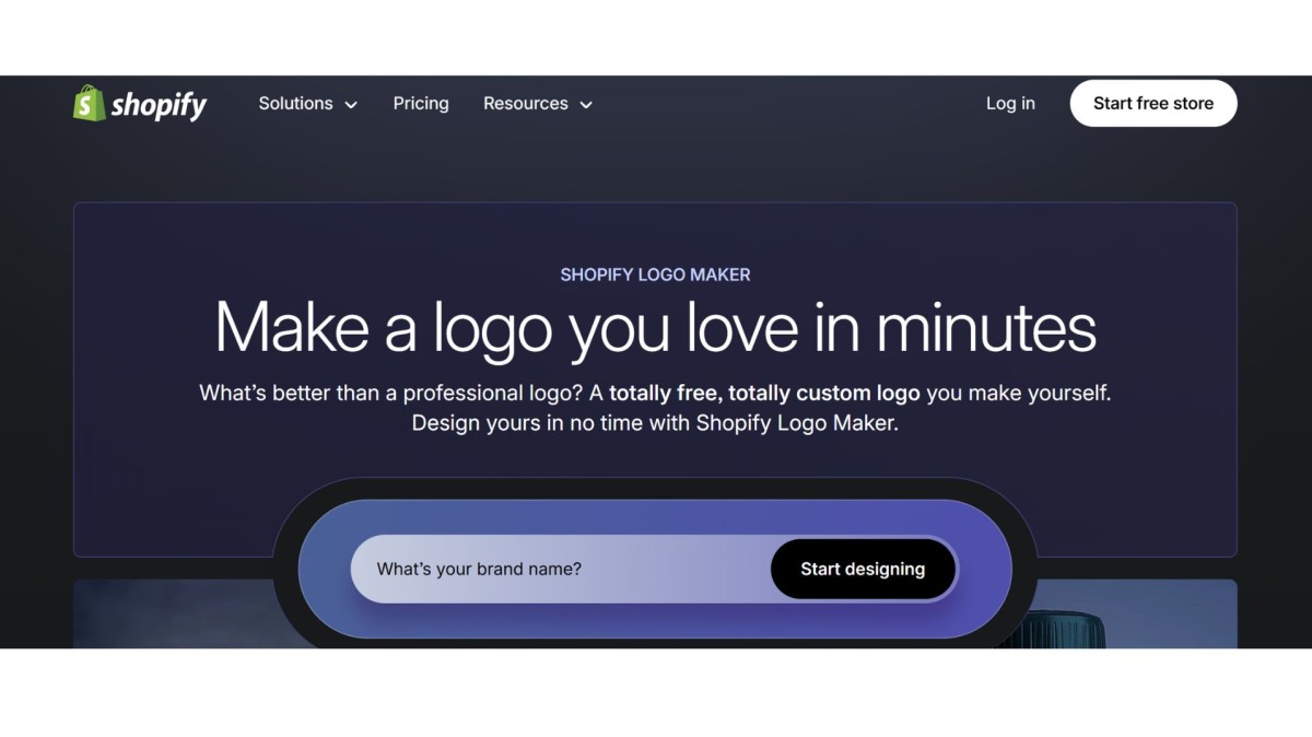
Free tool with modern logo presets, ideal for startups and online stores. Users can access different templates based on their industry and immediately download the logo they have created using these platforms.
The tools accommodate users who are not designers which means they will remain unconfused during their creation process. Users merely need to choose from multiple available templates before they begin customisation.
Food-specific icons, together with layouts and font combinations, are available through these platforms because they function correctly.
The platforms provide their users with brand kits, social media kits and editable format options.
These tools provide professional design capabilities through a smartphone solution suitable for budget-friendly companies, including start-ups and businesses working in the food industry.
Take several tools for a test drive until you discover the one that offers perfect flexibility and ease of use.Premade templates enable you to view how your logo looks on menus, business cards and realistic storefront visuals.
Logo Design FAQ
How do I know if my logo is good?
A solid logo must be simple to understand along with providing clear readability across various sizes and direct relevance to your food brand product line.
People will remember the logo when they encounter it throughout their positive experiences.
Before approving the design, you should request feedback from customers who are loyal to your brand as well as your friends.
Should I use text or images in my logo?
Your food label identity determines the type of logo design you should choose. Text-only logos bring a contemporary, neat look, whereas icons introduce a personal flavour to branding.
Using both elements simultaneously works for achieving balance when designing a logo. The burger chain Burger King has shifted from its traditional icon symbolism to a new text-centred brand mark.
Your selection should match your food brand identity and need to adapt well to different platforms.You should experiment with varied logo versions to determine which works best for digital alongside print distribution platforms.
Can I make a logo myself, or should I hire a designer?
Users who start their own businesses in the food industry can progress with DIY logo creators.
A professional designer should be your choice when aiming to develop customised branding materials or when the business shows signs of rapid expansion. The design artists provide logo modernisation services to clients who possess preliminary drafts.
Decide between affordability and timeframe by selecting a solution that combines both high quality and reasonable cost.
What format should I download my logo in?
Know all file formats and request all content files to include high-resolution PNG with transparency, the vector-based SVG version, and PDF format. Any of these three formats provides solutions both online and offline or in packages.
The flexibility of using square and horizontal formats alongside icon versions should be your goal when requesting designs.Your brand identity becomes sharp across all uses due to this precaution.
How important are colors in a logo?
Very important. Red and yellow trigger hunger. Green suggests health. Black adds luxury. Select colours that match your business personality as well as your food type. Utilise a maximum of two or three colours to prevent visually disorganised layouts. The emotional impact on customers from your colour selection needs evaluation for proper emotional response creation.
Final Thoughts
The year 2025 will bring food branding to the point where visual narratives will match flavour importance for consumer appeal.
And your logo? The establishment of your company brand begins by establishing its logo.
A logo functions as more than a simple design element since it represents your brand identity, while sales are conveyed without words through recognition.
Remembering logos remains more effective than recalling business names in consumer memory. A practical design possesses this formidable strength.
The Best Tools for Online Logo Design, and these design ideas and tips provide you with everything you need to respond to your requirements.
Using these guidelines will enable you to create a logo which presents both brand authenticity and customer attraction.
Your food brand needs the right visual identity which you can achieve now by beginning drawing, testing or using appropriate tools.


