When Burberry replaced its century-old serif wordmark with a clean sans-serif in 2018, designers had opinions. The move wasn't arbitrary. Sans-serif fonts signal modernity and accessibility. Serif fonts signal heritage and prestige. Burberry was telling a different story, in a different voice, without changing a single word. That's what font type does. Before anyone reads your copy, the typeface has already made an impression.
What are the main font styles?
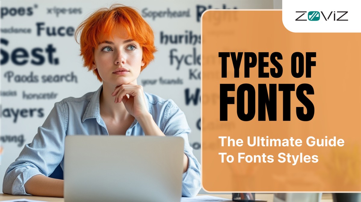
There are seven main font styles: serif, sans-serif, script, slab serif, display, handwritten, and monospace.
- Serif fonts have small finishing strokes on letters and feel traditional.
- Sans-serif fonts drop those strokes and feel modern.
- Script fonts mimic handwriting.
- Slab serif fonts have thick, blocky serifs built for impact.
- Display fonts are decorative and built for headlines only.
- Handwritten fonts feel personal and casual.
- Monospace fonts give every letter equal width, making them ideal for code.
Typography, Fonts, and Typefaces: what are the differences?

Typography is the art of arranging text so it's both readable and visually effective. It covers everything from which typeface you pick to how much space sits between lines.
Good typography balances two things: clarity and style. Can people read it easily? Does it reinforce the mood of the design? A wedding invitation and a tech startup pitch deck can both have good typography. They just make opposite choices to get there.
Within typography, two terms get used interchangeably that shouldn't be.
A typeface is the design family. Helvetica is a typeface. So is Garamond. It's the overall visual system: the letterforms, the proportions, the style.
A font is a specific version within that family. Helvetica Bold is a font. Helvetica Light Italic is a different font. Think of a typeface as a song. A font is a specific recording of it. Same song, different key, different energy.

Other terms to know
- Weight: how thick or thin the strokes are. Bold is heavy. Light is thin. Most typefaces offer several weights.
- Leading: the vertical space between lines of text. Too tight and lines blur together. Too loose and the eye loses its place.

- Tracking: uniform letter-spacing across a word or block of text. Useful for opening up a tight headline or tightening loose body copy.
- Kerning: the space between two specific letters. The classic example is "AV." Those two letters create an awkward gap that good kerning fixes.
- X-height: the height of lowercase letters relative to capitals. A tall x-height (like Roboto) improves readability on screens at small sizes.

Font Styles comparison table
| Font Style | Key Trait | Best For | Avoid For | Brand Examples |
|---|---|---|---|---|
| Serif | Small finishing strokes on letters | Print, editorial, luxury, law | Small screens at tiny sizes | Rolex, Tiffany, Vogue |
| Sans-serif | No finishing strokes, clean endings | Websites, apps, tech, UI | Formal print documents needing tradition | Google, Spotify, Airbnb |
| Script | Mimics handwriting, flowing strokes | Logos, invitations, packaging | Body text, small sizes | Cadillac, Cartier, Barbie |
| Slab serif | Thick, squared-off serifs | Headlines, posters, bold branding | Long body text at small sizes | IBM, Volvo, Rockwell |
| Display | Decorative, built for impact | Headlines, title cards, posters | Body text, anything under 24pt | Impact, Bebas Neue |
| Handwritten | Casual, imperfect, feels human | Social media, lifestyle, accents | Extended reading, small sizes | Dancing Script, Caveat |
| Monospace | Every character same width | Code, terminals, technical docs | Branding, headlines, body text | Courier New, Fira Code |
Understanding Font Types
Let’s explore the most common font kinds:
Serif Fonts

Serif fonts contain tiny features or marks at the finishing edges of forms, these are called ‘feet’. This fonts are standard and seem more professional, and for this reason they are found in books, newspapers, and other documents.
Serif fonts are used to offer an appearance to designed materials in order to convey the message of professionalism and maintenance of reliability. If your project desires to have formal or reliable appearance, a serif font should be selected.
Best for: body text in print, editorial design, law and finance branding, luxury goods.
Brands using serif fonts: Rolex, Tiffany & Co., The New York Times, Vogue.
Common examples: Georgia, Times New Roman, Garamond, Baskerville, Didot.
Serif Sub-categories
- Old-style serifs like Garamond have low stroke contrast and feel organic.
- Transitional serifs like Baskerville and Times New Roman have sharper contrast and feel more formal.
- Modern serifs like Didot and Bodoni push that contrast to an extreme, with very thick strokes next to very thin ones. The result is a high-fashion, editorial feel.
Sans Serif Fonts

The name sans serif means that the fonts do not have striking lines at the base of the characters. These fonts are not decorated with extra strokes at the ends of some of the strokes that make up a letter, and they are common with screen content since they are easier to read.
Shrinking text usually reduces its readability, so websites, applications, and presentations should use only sans-serif fonts for the headlines and body text.
Best for: websites, apps, presentations, tech branding, UI text.
Brands using sans-serif fonts: Google, Apple, Spotify, Airbnb, Netflix.
Common examples: Helvetica, Arial, Roboto, Inter, Futura, Open Sans.
Sans Serif sub-categories
- Grotesque sans-serifs like Franklin Gothic were the original commercial sans-serifs. Slightly irregular, more character.
- Neo-grotesque fonts like Helvetica and Arial are cleaner and more refined. Helvetica is still the single most-used font on the web.
- Geometric sans-serifs like Futura are built from circles, squares, and triangles. They feel precise and forward-looking.
- Humanist sans-serifs like Gill Sans have subtle stroke variation borrowed from calligraphy. They're warmer and more readable at small sizes.
Curious about fashion branding?
Luxury fashion brands are some of the most deliberate font choosers in the world. Our breakdown of famous fonts in fashion brands covers exactly why Chanel, Gucci, and Louis Vuitton made the typographic choices they did and what smaller brands can learn from them.
Script Fonts

Script fonts resemble a person's handwriting and are also known as curse writing fonts. It is customary to receive more round and, if possible, fancy lines so the fonts seem more ostentatious. These fonts are ideal for use in invitations, logos, or any product that needs a personal touch and creativity.
Script fonts are very elegant and fancy but should not be used for large amounts of text because they can be rather challenging to read at first glance; script fonts are suitable for short phrases and headlines.
Best for: logos, packaging, invitations, short-form display text.
Brands using script fonts: Cadillac, Cartier, and Budweiser use formal scripts. Barbie, Sharpie, and Ray-Ban use casual ones.
Common examples: Brush Script, Pacifico, Great Vibes, Sacramento.
Slab Serif Fonts

Slab serif is the most underappreciated category in typography. It has the same basic structure as a regular serif, with decorative strokes at the ends of letterforms. The difference is those strokes are thick, squared-off, and heavy rather than delicate. The result is a font that's sturdy and highly legible, with more personality than a plain sans-serif and more weight than a traditional serif.
Geometric slab serifs like Rockwell have consistent stroke weights throughout. Humanist slab serifs like Museo Slab have some variation, which makes them more readable in long-form text.
Best for: headlines, posters, editorial design, brand identity that needs weight without formality.
Brands using slab serif fonts: IBM, Volvo, Sony Ericsson.
Common examples: Rockwell, Clarendon, Courier New, Museo Slab, Archer.
Display Fonts

Display fonts are designed to be attention-grabbing and are often used for large text, like headlines or titles. They can be bold, quirky, or artistic, adding personality to your design.
Display fonts are great for grabbing attention but should be used sparingly, as they can overwhelm the reader if overused. Use a display font in body text and you'll lose the reader. One or two words in a headline, a brand name on a package, a single pull quote on a poster. That's the right habitat.
Best for: headlines, posters, signage, title cards, brand marks.
Common examples: Impact, Trajan, Bebas Neue, Playfair Display, Abril Fatface.
Typography is one layer of a complete brand identity. Our guide to typography in branding explains how font weight, spacing, and hierarchy work together across your full design system, from logo to business card to website.
Handwritten Fonts

These are writing styles for fonts that look like the writing of a human being that is why they are called handwritten fonts.They can be clean and simple, or cluttered and casual, which takes your design to a more familiar and comfortable level.
Handwritten fonts should not be used where lots of writing is to be written, its good especially for titles and logos since they add the feel of a human touch. Like script fonts, they degrade at small sizes. Use them for short phrases, titles, and decorative accents.
Best for: social media content, lifestyle branding, short quotes, product packaging accents.
Common examples: Dancing Script, Shadows Into Light, Caveat, Amatic SC.
Monospaced Fonts

This type of fonts is characterized by the fact that all the letter occupy the same amount of space while in most other fonts, the letter may be thin or thick in equivalent amounts. This creates a uniform look.
Monospace fonts are better if space measurement is of the essence for some projects such as codes, and technical documentations among others. For this reason, monospace fonts are standard for code editors, terminals, and technical documentation.
Best for: code blocks, technical documentation, developer tools, column-aligned text.
Common examples: Courier New, Consolas, Fira Code, JetBrains Mono, Roboto Mono.
Decorative Fonts

All the above written are the usual classified fonts, but there are other special kinds of fonts These are notified as Decorative Fonts They are more lively and usually used for certain occasions like festive season etc.
Already have a logo but not happy with the font? Our step-by-step guide to changing your logo font walks you through the whole process, from picking a replacement typeface to getting it right across every brand touchpoint.
How Different Fonts Shape Brand Identity
A logo is read in milliseconds. Font choice does most of the work in that window.

How to choose the right font style
Start with what the design needs to communicate, not the fonts you like.
Match the message. Trust and authority lean serif. Modernity and clarity lean sans-serif. Warmth and personality lean script or handwritten. Weight and confidence lean slab serif.
Know your reader. Body text for a general audience almost always wants a humanist or neo-grotesque sans-serif. Printed books and magazines can support a transitional serif. Code documentation needs monospace. Children's content works better with rounded, high-x-height sans-serifs.
Test at the smallest size it'll appear. Delicate serifs and script fonts that look beautiful at 72pt can fall apart at 12pt on a phone. Display fonts and slab serifs hold up better at small sizes.
Limit yourself. Two fonts is almost always enough: one for headlines, one for body text. A third accent font can work for pull quotes or CTAs, but only if it has a clear reason to be there.
Font pairing: the basics

Font pairing is the practice of combining two typefaces in a single design so they work together without competing.
The principle that holds up: pair fonts that are different in structure but similar in feeling. A high-contrast modern serif like Bodoni and a geometric sans-serif like Futura share a sense of precision and elegance. They feel like they belong in the same design even though they look different. Pair Bodoni with a casual handwritten font and the personalities clash.
Three patterns that reliably work:
- Serif plus sans-serif. The most common approach. Use the serif for headlines or body, the sans-serif for the other. Serif headlines feel editorial and authoritative. Sans-serif headlines feel clean and modern.
- Geometric sans-serif plus humanist sans-serif. Both are sans-serifs but with very different personalities. Futura (geometric, precise) paired with Gill Sans (humanist, warm) creates contrast without chaos.
- Display font plus neutral body font. Let one font have personality. Let the other disappear. If the headline is expressive, the body should be something invisible. A clean sans-serif like Inter or Roboto that doesn't compete.
Start with the right font for your brand
Font choice isn't decoration. It's the first impression your brand makes, before anyone reads a word.
If you're building a logo or brand kit from scratch, Zoviz gives you access to hundreds of professionally selected typefaces organized by style, mood, and industry, with real-time preview across your full brand identity.
Frequently asked questions
What is the difference between a font and a typeface?
A typeface is the design family. Helvetica, Garamond, and Futura are all typefaces. A font is a specific version within that family, defined by weight and style. Helvetica Bold and Garamond Italic are fonts. Saying "I'm using Helvetica" describes a typeface. Saying "I'm using Helvetica Bold at 18pt" describes a font.
Which font style is best for logos and branding?
It depends on what the brand needs to communicate. Serif fonts like those used by Rolex and Tiffany signal tradition and prestige. Geometric sans-serifs like those used by Google and Spotify signal modernity and clarity. Script fonts like those used by Cadillac and Barbie signal personality and authenticity. There's no universally best choice. The right font is the one that matches what the brand is actually saying.
What fonts are easiest to read?
For body text on screens, humanist and neo-grotesque sans-serifs perform best. Inter, Roboto, Open Sans, and Georgia are consistently reliable. The key factors are x-height (taller is more readable at small sizes), stroke contrast (less contrast works better on screens), and letter spacing. Avoid script and display fonts for anything longer than a few words.


