In 2025, the business environment will be more digital-oriented, dynamic, and interconnected. Companies and brands are trying to capture consumers' attention in a world where they receive information through different channels. In this kind of environment, logos created using a logo maker are not just required to be aesthetically pleasing; they must also be noticed, memorable, and effective, whether on print, television, or the Internet.This is where minimalist logos shine. Sleek and uncluttered, they can create an instant presence. Increasingly, companies are incorporating minimalistic logos into their designs, as this style presents many advantages and helps brands stand out better. However, why is this design trend so effective in 2025? Let’s explore.
Table of Contents
- What Are Minimalist Logos?
- Why Minimalist Logos Are So Popular in 2025
- Top Benefits of Minimalist Logos
- How to Create a Minimalist Logo
- Great Examples of Minimalist Logos in 2025
- What’s Next for Minimalist Logos?
What Are Minimalist Logos?
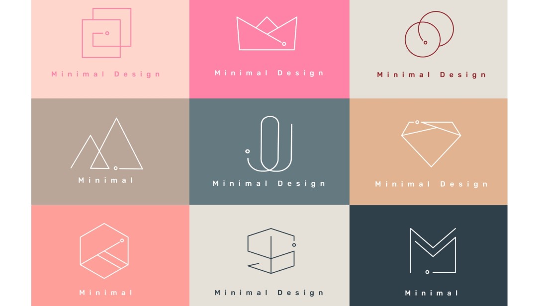
The Minimalist logos are very plain and do not contain any complexity. They strive to solve problems with the fewest elements possible, for instance, type, simple geometric forms, and a restricted range of colors if indicating the nature of the brand is the goal. Understanding Gestalt principles in logo design can enhance your branding by ensuring that your logo communicates effectively.
As we know, the concept of minimalist designs is based on the idea that limiting distractions can help the message recipient receive and process the rest of the message effectively.
Characteristics of Minimalist Logos:

- Simple Shapes and Lines: Many minimalist logos are formed from simple geometric shapes such as circles, squares, and triangles, which gives the composition an ergonomic appearance.
- Limited Colors: Minimalist logos tend to have very little color differentiation, often being limited to a single color or two. This makes it easy to avoid overcomplicating the design and allows one to offer a design that will work well with various backgrounds.
- Negative Space: Another identifier is where an object or image creates another shape or meaning by being surrounded by other objects or images, which improves the victory from simple shapes to complex appearances.
- Clean Typography: The texts used in minimalist logos are typically sans-serif, which is clear and trendy. This ensures that the logo is simple. Specifying preferred typefaces in your brand kit can help maintain brand consistency across all platforms and materials.
While some people think logos are just about simplifying things, minimalist logos better represent getting specifics right. With so much visual material available all day, these slogans are minimalistic and effective.
Why Minimalist Logos Are So Popular in 2025
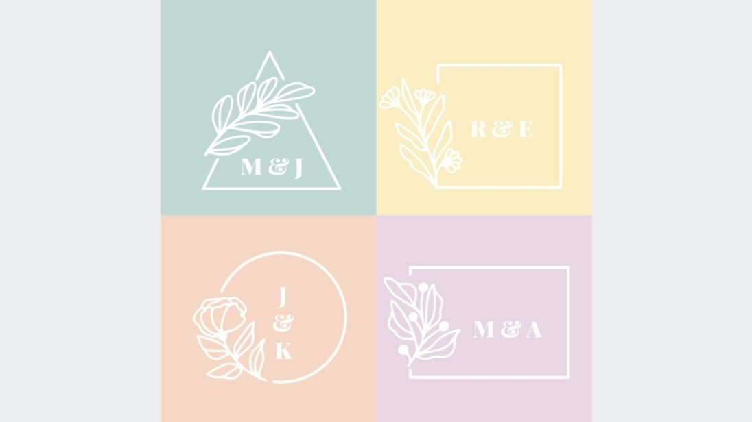
There are certain reasons why minimalistic logos were popular in 2025. Looking at the rising mobiFirst trend and the general trend of brands being forced to express themselves more, we see that minimal logos have been particularly flexible and iconic.
Key Drivers of Popularity:
- Multi-Platform Usability: The fact is that one of the most appealing features of minimalist logos is that they can easily be upsized or downsized depending on one’s needs and requirements. With more brands using mobile apps, the web, social media etc. to connect with their audience, logos have to fit in. This type of logo can be easily recognizable on a quantity of things starting from the profile picture on Instagram and up to the billboard.
- Fast Consumer Recognition: The modern customer is different: he or she is less patient and expects much more. Research has demonstrated that an individual takes not more than ten seconds to distinguish between different logos of brands. It is easier to understand a minimalist logo in one view, making the brand's information penetrate one's mind immediately.
- Universal Appeal: As the market expands and corporations cross international borders, they require a logo that will suit the global market. Logos with a low level of detail are nearly universal, which means that they can be understood by people of different cultures and languages.
- Clean, Modern Aesthetic: Since minimalism is linked with modernity and innovation, these logos will interest brands that seek to give a new image to their company. The clean-shaven logos bear minimalistic designs, which are in line with today’s technological and environment-friendly oriented world.
- Brand Loyalty: Since many minimalist logos do not include any design trends or fashion-conscious patterns, they create brand identity in the long run. That means they can avoid frequent changes in their designs, which keeps people coming back attached to a particular brand and logo.
Top Benefits of Minimalist Logos
Minimalism is more than just a logo design trend; it has several compelling benefits for organizations that seek to generate powerful, unified, and enduring brands. Let’s break down the key benefits that make minimalist logos so effective:
Key Benefits:
- Instant Recognition: Minimalist logos can easily be recognized and associated because they are built around one or more key components. Today, many organizations, such as Apple, Nike, Google, etc., have set an example in minimalistic logo design, which commands consumer sight lines.
- Versatility Across Media: Another advantage of minimalist logos is that they can actually be resized. Whether it is printed on a business card or forms a large billboard, the basic nature of the design enables its functionality in whichever size or format is applied to it.
- Cost-Effective Printing and Production: Simple logos imply the use of few colors and less complex shapes, so the cost of printing them will be cheaper. They can also be imprinted on a number of materials. This could be particularly helpful to new business entities or even new brands since branding can be an extremely valuable asset that small amounts of money can be spent optimally on.
- Longevity and Timeless Appeal: Simple logos cannot easily be associated with or risk being out of date as often as others. They are clear and simple, and besides the occasional tweaking, they can serve a purpose for years, even tens of years, before they require a total overhaul.
- Clarity in Messaging: The systematic elimination of most components inherent to graphic design contributes to making minimalist logos reliable messengers about what the brand will be like. They do not distract, and by and large, the communication is clean and simple, thus reflecting the true character of the brand.
- Professionalism and Trust: Professionalism usually goes with simplicity. Sometimes, minimalistic logos create a notion of professionalism and make the consumer trust the product more.
How to Create a Minimalist Logo
Designing a minimalist logotype can be quite challenging, as it seems at first glance, but effective planning and organization, together with appropriate choices of design elements, result in unique and efficient logos that signify the brand’s values. Understanding these principles is important for making a logo that stands out for your business. Focus on choosing the right colors for your logo to maintain a cohesive look
Step-by-Step Guide:
- Understand the Brand: Launched the process by getting to know brand benefits, values, and the target customer demographic. A minimalist design of the logo should reflect the main goal of the brand without any additions. Understanding color psychology in marketing & branding can also help shape public perception.
- Simplify the Elements: Reduce brand communication down to the barest graphical elements that make communication possible. This could be a single shape, letter, or any other abstraction that would give the brand identity in its basic form.
- Limit the Color Palette: When considering how to choose the best colors for your business logo, remember that minimalist logo designs are usually simple. A designer might use one or two colors for the logo, and black and white are very common. It is important to follow business colors, so avoid being hasty. Pick more colors to make it seem like you are covering all your bases. No, stick to a few important choices.
- Focus on Typography: If using text, opt for a Garamond or similar elegant typeface, but keep the color and font simple and classic since they insert simplicity into the design. Thus, Helvetica or Futura types of fonts are widely used in minimalist designs since they are simple to read and modern.
- Utilize Negative Space: One hallmark of minimalist logos is the effective use of negative. Minimalist logos' characteristics can be described as the right utilization of negative space. This is great; it added creativity to the design without overcomplicating it by adding more features to it.
- Test for Versatility: Make sure the logo is flexible and can easily fit mobile and print when designed in different sizes. A minimalist logo shall be just as effective if used as an emblem or as a symbol, small or large.
Great Examples of Minimalist Logos in 2025
Simplistic forms and shapes have become the design choices of many traditional and up-and-coming companies in 2025. Such logos are competitive for recognition and convey the idea of a brand’s image in a minimalist but progressive form.
Leading Examples of Minimalist Logos:
Hinge:
Dating application Hinge has a very straightforward logo with the capital “H” made of two strokes resembling hands. This signals togetherness and warmth without looking overly professional and complex, like many newer applications.
Stripe:
The chosen logo's strict wordmark with no decorations reflects the nature of the company, an online payment processor Stripe, biasing, no-nonsense.
Peloton:
Peloton company is a fitness brand. The icon is a simple geometric drive symbol that suggests motion and speed.
Calm:
Calm proposes a highly minimalist logo for its meditation application, using the word ‘Calm’ in a pacifying, unpretentious sans-serif typeface.
Monzo:
Monzo, a challenger bank, employs those elements to the maximum using a geometric icon that is professional yet has a modern feel and targets digitally active clients.
What’s Next for Minimalist Logos?

Minimalism is still changing, and 2025 will bring interactive, animated logos. Some brands apply motion design to logos because they are simple, but when they are animated, they add some sort of motion or experience to the logo.
Future Trends to Watch:
- Animated Logos: Motion is becoming more popular within logo designs. Minimalist logos can relay a story or provide more information about what or who they represent without making the logo more complicated.
- Interactive Logos: With even more brands welcoming digital experiences, logos that can transform in response to user input are growing in popularity every day.
- Sustainability Themes: As the need for sustainable designs becomes increasingly prominent, look for more simplistic logos that depict an aspect of sustainability, such as the use of organic shapes and natural tones of color.
As these trends evolve, it’s essential to learn when and how to refresh your logo to keep your brand relevant.
The minimalist logo will continue rising into the future with the intelligible idea of simplicity and innovation, ensuring that brands do not lose their good looks while delivering the message in a significant and startling manner.
Conclusion
Graphic logos are very simple, but they are here to stay. As we progress further into 2025 and beyond, their simplicity and elegance will continue to define effective branding.


