
Design is not about beauty; it is about helping people to find their way. Understanding how to provide your customers with the path to follow through the page Visual hierarchy is one of the essential design principles that allow the page designer to have control over the data distribution on the page and guide the customers’ attention to the necessary information. Headlines, images, and buttons are placed following rules of layering to apply the best visual hierarchy for brand kits and logo makers. Regardless of the site layout, advertisement, or any other graphic design, proper application of the visual hierarchy ensures that the necessary messages are emphasized and the eye-catching experience improves for the target consumers.
Increase in size, contrasts to the background, movement and contrast also make designs look great but also help the message to pass across as planned. In this guide, we take a deeper look at how you can implement visual hierarchy in detail so that your customers are drawn to the appropriate components of your design and do so in a more pleasant manner, ultimately enhancing the effectiveness of your brand.
Table of contents:
- Visual Hierarchy Basics
- Importance of Visual Hierarchy
- How AI Enhances Visual Hierarchy Better in Design
- Making Calls-to-Action Stand Out
- Maintaining Design Consistency
- Real-World Examples
- Conclusion
Visual Hierarchy Basics
There are many design principles out there but one that is most helpful in determining what your customers should see first, second, third, etc is called visual hierarchy. It is like leading their vision through the page and teaching them what they should see first.
Size and Scale
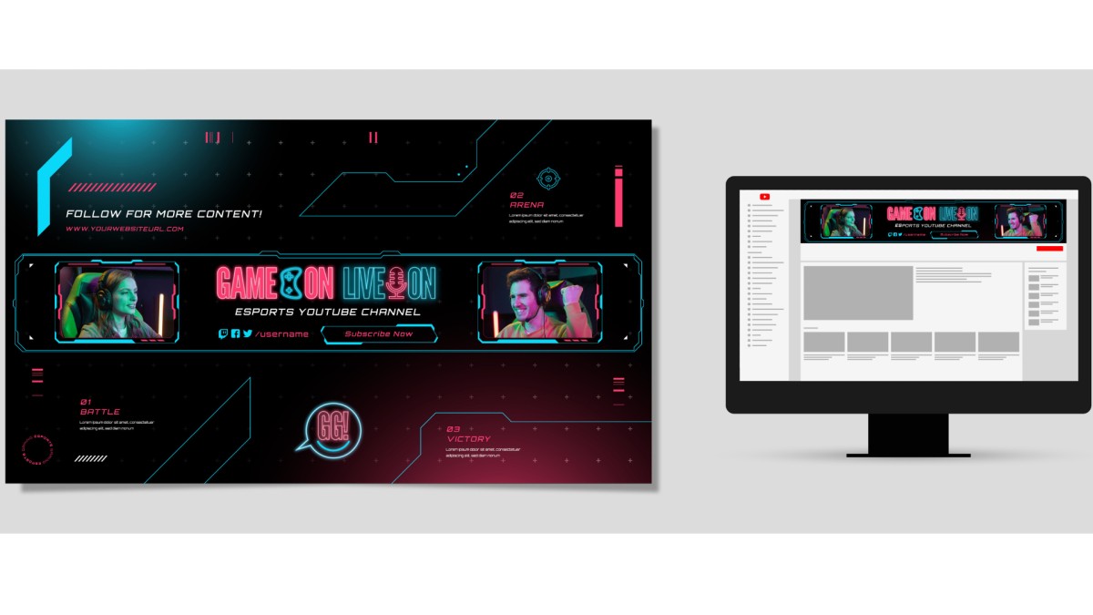
Key attributes crucial to attracting attention include areas of objects or text. The larger object is the first to attract attention, although the details are only observed after a certain period. For instance, a big and catchy headline placed at the top of the page will be noticed before the smaller text written below it. You can influence the order in which you want the viewer to examine something by setting the size of the components relative to each other.
Color and Contrast
Brand Colors can draw attention to specific areas you may want to emphasize in your design. An illustration in colors is noticeable, while dull colors are less attention-drawing. Contrast means how much one color is different from another color or how much variation exists between two different colors. The level of contrast for text differentiation can be either high, as in black on white, which makes them easily readable and noticeable, or low, to underline less significant information.
Positioning and Layout
The positioning of any items on a page is important, items that are located on the top or middle of a page, tend to attract more attention. By placing the important items where people might expect to find them, it will be easy to make sure that they notice what you want them to. Furthermore, organizing items in a logical order as people tend to follow top-bottom or left-right patterns is also beneficial to the viewer.
Whitespace (Empty Space)
Margin is the space surrounding the text or graphic image as the containers in a web page. It works to avoid overcrowding of the design and it enables you to highlight specific items. Whitespace allows people to focus on key parts of your design because the areas around these essential components are clearer. It also helps in removing unnecessary items from the page and makes it easier and less demanding on the eyes.
Typography and Font Weight
Typography refers to the style of the text. Different font sizes, weights (whether it is bold or light), and styles make it easier for you to highlight some of the words and phrases in the text. For instance, headings are generally in big or bold font as compared to the rest of the textual matter in the article, which is in small fonts. The choice of font is also very important in setting the atmosphere and the mood of the text.
Alignment and Proximity
Alignment refers to how objects are placed in relation to the margins of the page while proximity is about how close or far objects are from another. Proper alignment ensures that the design looks neat and, when grouping related items together, they are placed close together so it is easy for the people to understand that they are related. This provides the content with a well-structured and easy-to-understand format.
Importance of Visual Hierarchy
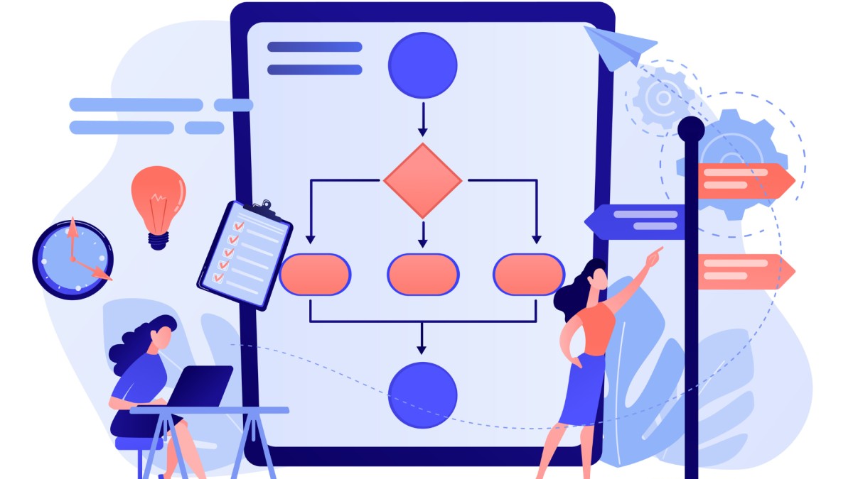
The reason why visual hierarchy is significant is because it facilitates the arrangement of information in a logical manner that is easily comprehensible. With the help of sizes, colors, or places for text and images, one is able to demonstrate what should be noticed first. For instance, a large and prominent title locates the content they are looking for within the shortest time. This means that when things are well arranged, users do not get stranded or confused about where to go or what to look for. This is more useful in websites and applications, where people would prefer direct information to be provided to them. In short, visual hierarchy serves to make the information well-arranged and the designs more comprehensible to users.
How AI Enhances Visual Hierarchy Better in Design

With AI, or Artificial Intelligence, the consideration of visual hierarchy is improving in the field of design. It can watch how the people interact and what they are interested in to adjust layouts, colors, and fonts to make the information more digestible. For instance, AI can predict which sections of a website or an application draw the attention of a user and can reformat the layout, ensuring that the critical items get attention. AI can also be useful in offering suggestions or performing basic actions like scaling photos or shifting blocks of information on the layout. This helps maintain a strong hierarchy of visual elements regardless of whether the user is operating a phone, a tablet, or a PC.
Making Calls-to-Action Stand Out
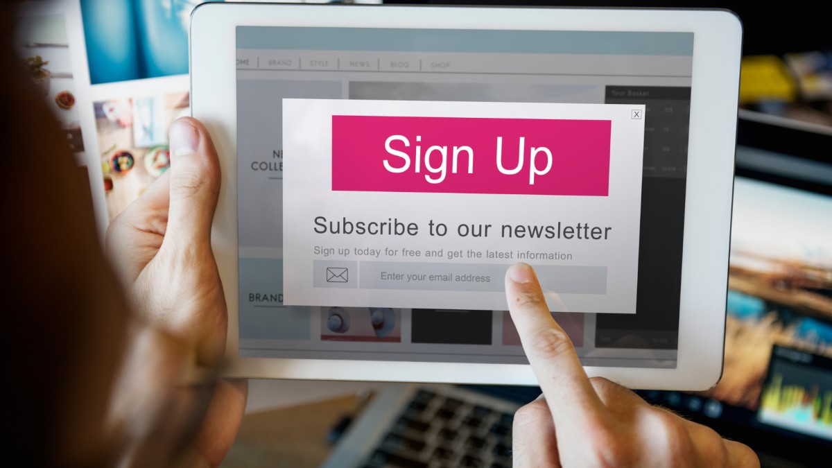
A call-to-action (CTA) is an immediate action a designer includes in the design and encourages a specific action from the user.
Use Contrasting Colors
Make your call to action CTA’s color significantly different from the rest of your design elements’ hues. Those that are bright and clear or slightly contrasting with the background can catch the eye right away. For instance, having a bright red or green button against a background of a lighter color in the page will help to expose the CTA better.
Increase Size and Use Bold Text
If possible, make the CTA button or the text bigger than other components on the page so that it stands out more. Some of the formatting options include making the CTA in big or highly contrasting fonts from the rest of the text. For instance, the “Sign Up Now” should be in a larger font than the regular Internet text to draw the attention of the consumers.
Strategic Placement
Ensure that you place your CTA in an area where the targeted users will be most likely to notice it. Typically, it is best to position banners at the header or middle of a page or at the footer when users are done reading. Make sure it is placed in a position that blends with the flow of the user’s experience in the content.
Clear and Action-Oriented Language
Avoid the use of passive voice and instead use active voice that guides users with clear instruction on what they need to do. Words such as “Buy Now”, “Subscribe Today,” or “Learn More” are simple and directly convey the required action to the customer. Do not use broad terms that do not point to the value being offered or the call to be made.
Add Visual Cues
Use images such as arrows, icons, or borders to direct the user’s attention to the CTA or button. Such cues can lead the user’s eye toward the CTA button and even draw attention to its significance. For instance, placing an arrow leading directly to the ‘Download’ button helps to bring focus to that particular button.
Include Whitespace
Ensure that your CTA is isolated by more white space, this will make it stand out from the crowd. Whitespace allows CTA to be easily distinguished from other content and guarantees that a user will notice it. Since some space is left around the CTA, it looks less congested and encourages the users to click on it.
Test and Optimize
Always try to put your CTA to the test and experiment with the color, size and location of the button. Employ A/B testing to differentiate between two button designs and the CTA design adjusts according to response and effectiveness rates.
Maintaining design consistency
Implementing design consistency means ensuring that the appearance of an entire design is consistent and organized. This goes a long way in giving one's work a common and professional look, thus making it easier for the users to identify what they are looking for.
Use the Same Fonts
It is recommended to stick to one or two fonts for the entire design. The non-usage of different types of font for headings, subheadings, and body copy keeps the layout simple and easily readable.
Stick to a Color Scheme
Choose a collection of colors and stick to those colors when designing. These include the text, the backgrounds, buttons, and borders on the screen. Using a consistent color scheme enhances consistency and promotes brand image recognition.
Keep Layouts Uniform
Group similar items such as text, images, or buttons, and ensure that their placement is uniform across various pages or divisions. For example, if you locate your website's main menu at the top of one page, it should remain at the top on other pages as well.
Follow Consistent Spacing
It is helpful to keep equal distances from elements, such as margins and padding, to achieve a sense of tidiness in the layout. Proper spacing avoids crowding the items and enhances the neat arrangement of the layout.
Apply Similar Design Elements
Make buttons, icons, and other controls look like they belong to the same set. For example, if you use rounded corners at one page for your buttons, then every other page should have buttons with rounded corners as well.
Be Consistent with Tone and Voice
The same way of writing should be used in the text, as well as the images used in the text. If your brand’s personality is informal, then all texts should be written in this tone.
Real-World Examples
Netflix’s Interface
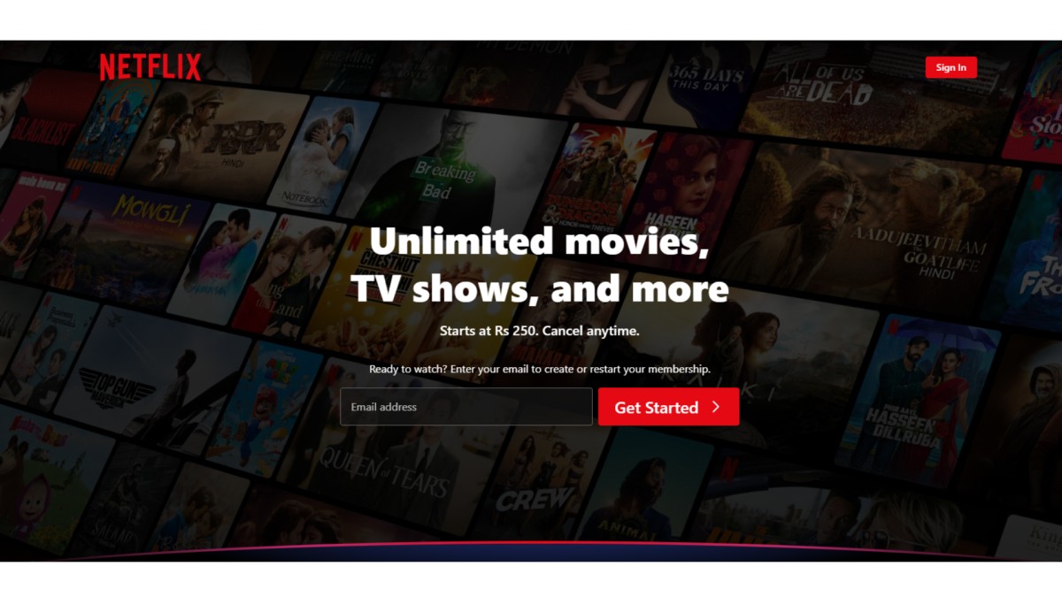
The Netflix streaming platform remains consistent in its design. The location to search for the content, to view information about them, and profile management are organized. The choice of a dark-scheme color and easily recognizable icons helps to achieve comfortable usage of the application.
Microsoft Office Suite
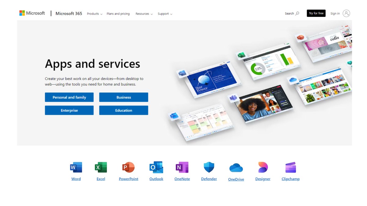
Microsoft Office applications, including Word, Excel, and PowerPoint, share a similar design. The ribbon bar menu, icons, and colors applied across the various Office applications are similar, and users who move from one application to another do not have to use different interfaces.
Conclusion
A primary element in the design world is called visual hierarchy, which aids in making your content more accessible. This way, you ensure that the attention of your customers is focused on the key points, which will result in a strong and effective message. Even the most basic changes to aspects such as size, color, and location can help to make your designs pleasing to the eye and easy to understand. The same thing is what makes it even better with the use of AI since designs can be adjusted based on what is preferred and required by users. Essentially, keeping the calls to action visible and using consistent design will also ensure that the flow of your content appears professional. By applying these approaches, it is possible to grab the audience’s focus, enhance the experience of a client, and inspire a particular behavioral response.


