
Your e-commerce brand faces the danger of blending into the marketplace without an appropriate logo.
The first visual element people see belongs to your logo.
Before anyone reads anything, the logo starts developing trust with viewers.
Your logo creates an authentic display that builds trustworthy appearances.
The power of an effective logo ensures your users transform into buyers for your new store startup or existing rebrand.
This guide provides a complete explanation, starting with e-commerce logo strengths and continuing with best AI tools for developing logos without templates.
Table of Contents
- What is an E-commerce Logo?
- 3 Key Principles of a Good E-commerce Logo
- 8 Tips for Creating an Effective E-commerce Logo
- Examples of Great E-commerce Logos
- Using an E-commerce Logo Maker
- Mistakes to Avoid When Designing a Logo
- E-commerce Logo FAQ
What is an E-commerce Logo?

The visual identification mark for your online store functions as an e-commerce logo. A logo may utilize a name along with an icon or stick to a single name or icon. Online stores require visually attractive logos that must work for websites, mobile applications, packaging, and social media platforms.
Your logo functions as your virtual business front. The logo enables both recall and trust at a time when customers are overwhelming numerous competitors on the market.
People usually encounter your logo through it before they start any interaction with your brand. Your business logo should be well designed therefore customers feel more confident about shopping with you. Online trust development matters particularly because physical interaction becomes more difficult when doing business digitally.
3 Key Principles of a Good E-commerce Logo
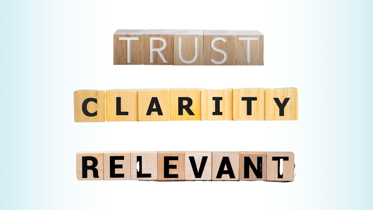
1. Trustworthiness
- Your business receives its first customer touchpoint through the logo, which usually appears before potential clients encounter it. Customers will doubt your professionalism if your logo appears difficult and unprofessional. Trustworthy logos enable customer emotions to bond with the brand, thus stimulating engagement and sales.
- How to achieve it: The achievement of trustworthy values through logo design depends on simple lines and balanced elements together with a sophisticated design approach.
2. Clarity
- What Drives Impact: A logo requires complete understanding from viewers during their initial moment of attention. A logo that provides confusing graphics or creates difficulty in comprehension may cause your audience to take a negative view of your brand. A basic logo design produces memorability, which results in easier brand recognition over time.
- How to achieve it: Achieve it by eliminating clutter and deleting unnecessary details. A logo needs basic, clear elements which enable flexibility and scalability when used. A logo that is easy to understand will keep its content strong both as a small favicon and as a large advertising billboard.
3. Relevance
- Your brand identity finds comprehension through its logo, which represents your company values. An off-target logo that diverges from your business offerings will create confusion for your customers. Your business logo must be pertinent to the products or services you offer because this element helps customers immediately grasp the purpose of your brand, thus enhancing their connection to their requirements.
- How to achieve it: The objective can be achieved by choosing design elements, particularly colours, together with fonts and icons that belong to your specific brand niche. The logo of a technology retail store will demonstrate contemporary minimalist characteristics, while hand-made jewellery businesses choose elegant lettering alongside muted colour schemes.
- Example: The logo represents an eco-friendly brand that uses natural elements combined with earthy colours to convey its sustainability message.
8 Tips for Creating an Effective E-commerce Logo

1. Know Your Brand First
- The lack of brand vision, which defines core values and mission, will make your logo ineffective. Your brand logo will directly connect with customers while maintaining core values when you start with defining both your brand personality and your target audience. Businesses often collaborate with design as a service platforms for consistent brand identity creation across all visual assets. Defining your logo foundation provides essential meaning through which it can serve its purpose.
- What to do: Your next step should be to determine between contemporary and vintage styles and powerful and simple elements for your brand. Understanding your brand’s identity can help you determine your design choices throughout your visual assets and apply these to help you create a feeling of consistency within your design.
- Example: For example, specialists from Overnight Glasses, same day glasses delivery store, advise new e-commerce brands to reflect their core values and speed of service through sleek, modern typography and vibrant, energetic colors.
2. Use Readable Typography
- Difficult-to-read logos make customers feel the same frustration as struggling to understand unreadable printed words. Your branding reaches maximum visibility because legible text makes it easy to identify your brand name no matter which platform people encounter.
- What to do: You should choose easy-to-read fonts, specifically sans-serif types, since they perform better online. Your logo should use plain sans-serif fonts to prevent legibility issues of complex typography.
- Example: The e-commerce logo using Helvetica or Arial fonts maintains readability for mobile viewing applications.
3. Pick a Versatile Layout
- The Chart for Success Indicators Shows That Brand Mark Designs Need to Stay Clear and Appealing When Used in Small Icons and Large Print Elements. A portable layout design allows your logo to remain shaped into numerous applications while preserving its distinctiveness in all sizes.
- What to do: Create ribbons for your logo in three distinct styles by designing them in square, vertical, and horizontal formats. Your logo will automatically convey its intended impact because you created multiple versions suitable for platforms ranging from websites to social media.
- Example: Coca-Cola exemplifies how its recognizable logo works without loss of impact between billboards and small program icons.
4. Choose a Meaningful Color Palette
- Brand perception originates from the essential role of choosing the right colour for your logo and which colours play in shaping consumer perception. Your choice of colour for a logo determines how people understand your brand, so selecting the correct colours requires attention to ensure audience connection. The choice of colour creates particular emotional responses in customers, which affect their purchasing behaviours.
- What to do: Your branding identity should guide your decision to select appropriate colours for logo design. Trust-related branding commonly employs blue, whereas eco-friendliness typically utilizes green as a colour choice. Your selected colour scheme should function effectively when used both in colour and black-and-white versions.
- Example: Green serves as an emblem for environmental-friendly brands, including Whole Foods, whereas blue dominates IBM and Dell's technological logo design because of its reliable association.
5. Use Simple, Clean Graphics
- Complicated icons and clip art will drive your logo away from achieving professional quality and create an unorganized appearance. Having a basic graphic helps create logos which people can recognize easily and remember well. Such design creates memorable marks, which also prevent visual interference.
- What to do: Select basic images with minimalist design and brand-relevant meanings that match your industry category, as Minimalist Logos Are Taking Over in 2025.
- The shipping business identity can be communicated through a graphic representation of a box, while an online marketplace can be represented through a shopping cart graphic.
- Example: The Shopify logo presents a minimalist shopping bag image that maintains clear recognition.
6. Design for Scalability
- The size of your logo affects impact because it needs to display properly on tiny mobile icons as well as large advertisement banners. Scaling your logo needs to preserve all details for readers to maintain both consistency and readability. The logo should provide an optimized display at any size to maintain both clarity and sharpness.
- What to do: You should work with vector-based designs since they maintain their quality when you resize them. Thanks to this approach, your logo maintains top-notch quality regardless of its displayed dimensions.
- Example: Nike's swoosh logo maintains clear effectiveness throughout all sizes, from smartphone app small icons to large billboard displays.
7. Make It Memorable
- The Impact Factor Depends on Whether the Logo Represents Something Generic. Your distinctive branding element will create stronger rememberability in your customers, who become more likely to identify your company through these images. A creative design approach for your brand will create a unique market position when facing competition.
- What to do: To develop an effective symbol, choose originality instead of using standard images. Logos with eccentric icons, along with strong colour elements, help people remember them better.
- Example: Amazon, Etsy, and Shopify represent three distinctive yet memorable logos that anyone can easily recall.
8. Test It Out
- Testing must be your last step to guarantee that your logo functions optimally in all applications before reaching the final stage. The process of checking how your logo behaves under diverse conditions allows you to find functional problems while assuring its effectiveness when used in actual situations.
- What to do: Prior to the finalization stage, conduct mockup testing of the logo in settings such as website headers, product identifiers, application icons, and social media profiles. Various users should provide feedback to confirm your design works as intended.
- Example: Google stands alongside numerous successful brands that have conducted multiple logo design tests to determine their final version.
Examples of Great E-commerce Logos
These brands have successfully designed their e-commerce logos as displayed through three examples:
1. Amazon
Amazon's logo incorporates a barely noticeable arrow connecting points A and Z, which demonstrates how their platform provides full product variety with speedy transportation. It's simple yet instantly recognisable.
2. Etsy
Etsy displays its logo in a serif font, which reproduces an artisanal boutique atmosphere corresponding to its handmade, vintage store marketplace.
3. Shopify
Shopify creates effective app icons using a shopping bag icon bearing an "S", which users can identify quickly when they glance at their devices. It's minimal, clear, and effective.
Simple logos demonstrate that contemplation leads to strong trust building and identity establishment between brands and their consumers.
Using an E-commerce Logo Maker
The creation process from nothing initially appears complex until you discover how online tools simplify it specifically for novice designers. Here are a few that can help:
Zoviz
Zoviz operates as a professional AI logo generator platform which allows users to create custom design solutions. Zoviz attracts online brands that require professional brand packages, which include business card templates with social media-ready assets for digital and printed forms.
This tool presents a simple design layout which makes logo creation available to users with no design background.
Canva
Users can easily create well-designed e-commerce logos using Canva because of its intuitive drag-and-drop features, which enable access to numerous templates and font options.
Users who want professional-looking logos without excessive hassle can make and customize images swiftly through the platform.
Looka
Responding to some questions through Looka will produce logos that precisely match your style. This service suits users who need a quick way to begin their design process.
Users can access branding kits through this service to maintain visual consistency that extends between their website and social media profiles.
Tailor Brands
The platform provides logo design services together with complete brand kits as well as automation tools that work well for sustaining brand management.
The platform allows users to produce marketing resources, which include business cards, brand books, and social media content.
Users can view previews of each platform for free, but you need to pay before downloading commercial or high-res files from any of these services.
Mistakes to Avoid When Designing a Logo

1. Overcomplicating the Design
Excessive colours, together with too many fonts and visual elements, create a confusing logo design. Keep it simple and focused.
2. Copying Other Brands
The inspiration from other logos is acceptable, yet complete duplication should be avoided. A unique identity develops through originality.
3. Ignoring Mobile and Small Screens
Your logo should be visible in all dimensions because unclear appearance at reduced scales results in recognition loss in critical scenarios.
4. Using Low-Quality Graphics
Pixelated or stretched graphics will reduce your professional image in the market. Every logo file must be designed using high-resolution or vector format options.
5. Skipping Feedback
Your love for the design does not prevent others from detecting problems with it. You must seek truthful viewpoints from others before you launch your product.
E-commerce Logo FAQ

How much should I spend on a logo?For professional branding purposes along with professional logo quality, you should allocate a budget of $20–$50.
Should I use an icon or just text?Using only a wordmark stands as an appropriate branding choice when your business name exists in a unique category.
What format should my logo be in?A logo should always be downloaded in JPEG (general usage), PNG (with a transparent background) and SVG (optimized for scaling purposes).
Can I change my logo later?Consistency establishes recognition since you should change it from little to none. Select a design that will work effectively forever.
Where should I use my logo?Your logo can be found on your website alongside social media accounts, packaging materials, newsletter receipts, a browser tab (favicon), and other promotional elements.
Should my logo match my website colours?Yes. Your brand will appear stronger when your logo uses colours from its palette because this practice develops a professional aesthetic.
Final Thoughts
An e-commerce logo needs to function beyond its visual appeal and must establish trust along with recognition among customers.
Everyone from Canva users to Zoviz customers should focus on creating logos which represent their business identity while connecting with their intended customer group.
Spend enough time to complete the process. Immediate production of designs to fill the requirement should never be your priority. Thoroughly analyze the design, followed by practical testing, and then ask others for their evaluation.
Keep it clean. Keep it relevant. The logo needs to present an accurate message about your brand.
The quick pace of online shopping requires exceptional initial impact because consumers base their decisions on what they see at first glance.


